Warm Living Room Colors: The Best Warm Paint Tones to Use
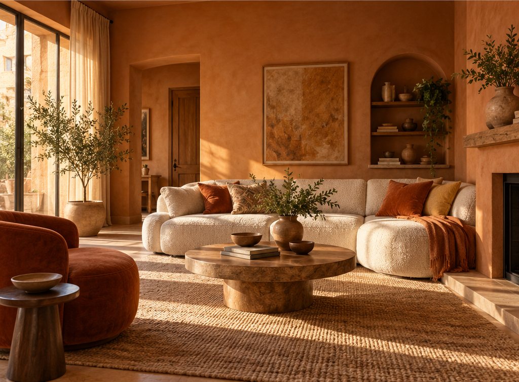
Warm living room colors are paints with red, yellow or orange undertones: cream, warm white, greige, sand, clay, terracotta, caramel, ochre, olive and cocoa. The most livable sit at an LRV of 30–75; here are 9 tones, 5 warm color schemes and the light-direction rules.
Part of our guide: Interior House Paint Ideas: Color Schemes & Room Paint Design
Key takeaways
- A warm paint color has a red, yellow or orange undertone; it does not have to be dark or saturated, and most warm living rooms use colors at an LRV of 30–75
- North-facing living rooms need warmer, more saturated tones (cream, clay, caramel) because cool light drains yellow and beige to gray
- Build a warm color scheme on a 60-30-10 split: 60 percent wall color, 30 percent a second warm neutral in textiles and wood, 10 percent a deeper accent
- Warm colors look best in matte or eggshell; gloss cools and flattens them under artificial light
- Pair warm walls with 2700K bulbs; 3000K and above turns clay and ochre muddy
Warm living room colors are paint tones with a red, yellow or orange undertone, from warm whites and creams through greige, clay and terracotta to caramel, ochre, olive and cocoa. The most livable wall colors sit at a light reflectance value (LRV) of 30–75, read as warm under 2700K light and pair with timber and wool. Here are nine warm paint tones, five schemes and the light-direction rules.
Warm colors in a room do a specific job: they make the walls feel closer and the air feel softer, which is why they dominate living rooms, dining rooms and bedrooms while cool colors win in bathrooms and offices. In 2027 the warm end of the chart is also where the trends sit, with cocoa, butter and earth tones leading our 2027 color palettes. This article belongs to our interior painting ideas pillar and goes deeper on one question: which warm paint color, and where.
- Undertone: red, yellow or orange; the amount decides whether a color reads as a warm neutral or a warm color.
- LRV for walls: 30–75 in most living rooms; 15–30 for a cozy, enveloping room; 75–85 for a warm white.
- Light source: 2700K lamps and dimmers; warm paints go muddy under 3000K+ or daylight-balanced LED.
- Finish: matte or eggshell on walls; satin only on trim.
- Scheme split: 60 percent wall, 30 percent secondary warm neutral, 10 percent deep accent.
What counts as a warm paint color?
A warm paint color is any color whose undertone leans toward red, yellow or orange on the color wheel, which includes obviously warm tones like terracotta and ochre and also quieter ones like cream, beige and a yellow-based greige. Warmth is about undertone, not darkness or brightness. A pale ivory with a drop of yellow in it is warm; a mid-gray with a blue base is cool, even though it is darker. The quickest test is to hold the sample next to a sheet of plain white printer paper: a warm color looks faintly yellow, peach or pink beside it, a cool one looks faintly blue, green or violet.
In practice, warm interior paint colors fall into three groups, and most living rooms use one from each:
- Warm whites and creams (LRV 75–88): the envelope colors. Ivory, cream, chalk, linen white. See warm white paint colors for the full set.
- Warm neutrals (LRV 35–70): beige, mushroom, warm greige, sand, oat, camel. See neutral paint colors for the cool-versus-warm sorting.
- Warm colors proper (LRV 10–50): clay, terracotta, ochre, caramel, rust, olive, cocoa, brick. These carry a scheme rather than support it.
Which warm living room paint colors work best?
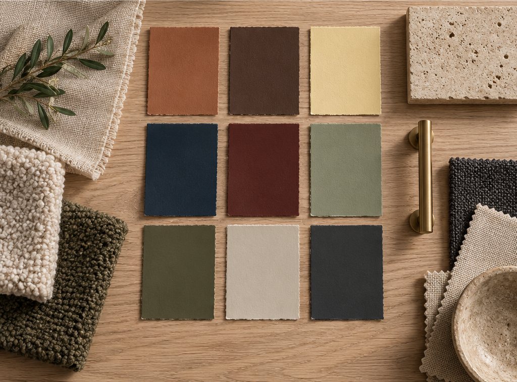
The warm living room paint colors that work best across the most rooms are cream, warm greige, clay, caramel, soft terracotta, ochre, olive, cocoa and warm white, each at a specific LRV band. The table below is how we think about them when specifying a room.
| Warm tone | LRV range | Undertone | Reads as | Best light | Pairs with |
|---|---|---|---|---|---|
| Warm white / chalk | 80–88 | Yellow, faint pink | Soft, bright | North or east | Oak, linen, brass |
| Cream / ivory | 72–82 | Yellow | Classic, gentle | North | Walnut, sage, black |
| Warm greige / mushroom | 45–65 | Yellow-red, some gray | Modern neutral | Any | White trim, pale oak, charcoal |
| Sand / camel | 40–60 | Yellow-orange | Sunny, relaxed | North or east | Cream, rust, rattan |
| Clay / blush-terracotta | 30–50 | Red-orange | Earthy, current | Any; glows at dusk | Olive, cream, travertine |
| Caramel / butterscotch | 25–45 | Orange-yellow | Cozy, retro | North | Cocoa, ivory, chrome |
| Ochre / mustard | 25–45 | Yellow | Bold, warm | North | Navy, ink, cream |
| Olive / warm khaki | 15–35 | Yellow-green | Grounded, calm | South or west | Clay, brass, oat |
| Cocoa / warm brown | 8–25 | Red-orange | Enveloping, luxe | South | Cream, caramel, tan leather |
#F3EBDD#EDE1C8#C8BBA6#D2B48C#C98A6B#C49A5A#C9963A#7A7A50#5E4030For a cozy, enveloping room, pick from the lower half of the table; for a bright, airy one, from the top. Warm cozy living room colors in 2027 cluster around clay, caramel and cocoa, with olive as the cooler-leaning partner that keeps the scheme from tipping into orange.
How does the direction of light change warm wall colors?
North-facing light is cool and blue, so it drains warm wall colors toward gray and needs a warmer, more saturated paint; south-facing light is yellow and strong, so it amplifies warmth and lets you use quieter tones. This is the rule most people get backward. They paint a north room a pale beige expecting a glow and get a flat putty, or paint a south room terracotta and get a sunset at noon.
By orientation
- North-facing: choose colors with more yellow or red than you think you need: cream rather than warm white, camel rather than beige, clay rather than blush. Avoid warm greiges with a lot of gray; they turn cold.
- South-facing: almost anything warm works; the risk is too much. A warm greige, a mushroom or an olive will still feel warm here, and a strong terracotta may feel hot in summer.
- East-facing: bright warm light in the morning, cooler by afternoon. Mid-LRV warm neutrals (sand, mushroom, light clay) stay balanced through the day.
- West-facing: cool in the morning, strongly warm at sunset. Olive, warm greige and cocoa handle the swing; ochre and caramel can glow orange in the evening.
Always sample on at least two walls, 24 × 24 in (61 × 61 cm), and look at the patches at 9 am, 2 pm and after dark under the lamps you will use. A color that passes all three readings is the one to buy.
What is a good warm colour scheme for a living room?
A good warm color scheme for a living room uses the 60-30-10 rule: 60 percent of the visible surface in the wall color, 30 percent in a second warm neutral carried by the sofa, rug, curtains and timber, and 10 percent in a deeper accent that appears three or four times. Here are five schemes we return to, each listed as wall, secondary, accent, with the metal and wood that finish it.
| Scheme | Walls (60%) | Secondary (30%) | Accent (10%) | Wood and metal | Mood |
|---|---|---|---|---|---|
| Cream and clay | Cream, LRV 78 | Clay upholstery, oat rug | Olive cushions, a dark olive lamp | Pale oak, aged brass | Soft, Mediterranean |
| Warm greige and rust | Warm greige, LRV 55 | Ivory sofa, sand curtains | Rust throw, rust ceramic, rust art | Walnut, black steel | Modern, grounded |
| Caramel drench | Caramel, LRV 35, walls and trim | Cream bouclé, camel leather | Chocolate and black | Smoked oak, bronze | Enveloping, 1970s-modern |
| Olive and ochre | Olive, LRV 25 | Oat linen, jute rug | Ochre velvet, mustard cushions | Teak, unlacquered brass | Rich, collected |
| Chalk and cocoa | Chalk white, LRV 84 | Cocoa velvet sofa, chocolate rug | Terracotta pots, clay ceramics | Walnut, brushed nickel | Bright, warm-minimal |
Each of these can be built from the palette library, and the whole-house color scheme guide shows how to carry one of them through the rest of the home so the living room does not feel like an island. If you want the fully drenched version, where walls, trim and ceiling take one warm color, the color drenching guide covers the method.
Which warm colors for living room walls feel cozy without feeling dark?
Clay, caramel, sand and warm greige at an LRV of 35–55 feel cozy without feeling dark, because they absorb enough light to soften the walls while still bouncing half of it back into the room. The sweet spot for a warm cozy living room that still works in daytime is that middle band. Below LRV 25 the room becomes a moody room and needs the lighting strategy in our dark living room ideas guide; above 65 it reads as bright rather than cozy.
Three ways to add cozy warmth without lowering the LRV much:
- Paint the ceiling the wall color or a 10 percent lighter version of it, which removes the white lid and makes a mid-tone wall feel enveloping.
- Use limewash or a chalky matte, which gives a mid-LRV color the cloudy variation of a deeper one.
- Carry the wall color into the trim, so there are no bright white lines cutting the room into pieces.
How do warm colors in a room work with cool elements?
Warm wall colors need a small amount of cool contrast, usually 10–15 percent, to stay fresh: a slate-blue cushion, a black metal lamp, a green plant, a marble top with gray veining or a cool-white ceramic. All-warm rooms can slide toward beige-on-beige, which is what people mean when they say a room looks dated. The contrast does not have to be a color; black, charcoal and chrome count as cool and give the same lift. The mixing metals guide explains how a brass-and-black pairing does this with hardware alone.
Two combinations that always work: warm walls with one cool-toned natural material (marble, limestone, slate), and warm walls with one dark element (an ink or charcoal sofa, a black fireplace surround, dark window frames). Keep the cool element matte and natural rather than glossy and synthetic, and the room stays warm.
Which finish and lighting keep warm paint tones looking warm?
Matte or eggshell finish, 2700K bulbs with a CRI of 90 or above, and dimmers on every circuit keep warm paint tones looking the way they did on the sample. Light source is the hidden variable in warm color interior schemes. A clay wall under a 4000K "daylight" LED turns gray-pink; the same wall under a 2700K bulb glows. Specifically:
- Bulbs: 2700K for living rooms, 2200–2400K for evening-only lighting; CRI 90+ so the reds and yellows in the paint render fully.
- Finish: matte or flat for the softest warmth, eggshell for a wipeable compromise. Gloss and semi-gloss reflect lamp light as white glare and cool the color. The paint sheen guide explains why.
- Layout: three circuits, with lamps near the walls so light washes the color; see how to layer lighting and size it with the lighting calculator.
- Shades: linen, paper or cream fabric, which cast warm light; avoid white plastic diffusers.
How do you choose and apply a warm wall color, step by step?
Choosing a warm living room paint color takes about a week of sampling; applying it takes a weekend. The sequence that avoids repaints:
- Identify your light. Note which way the main window faces and when the room is used most. North and evening rooms go warmer and deeper; south and daytime rooms go quieter.
- Fix the permanent warm elements. The floor, the fireplace, the sofa fabric and any timber are your undertone anchors. Hold samples next to them; a yellow-oak floor wants a cream or clay, a red-oak floor wants a greige or olive to calm it.
- Shortlist three tones from one band of the table above, for example three clays between LRV 35 and 45, not a clay, a cream and an olive.
- Sample large. Two coats on 24 × 24 in (61 × 61 cm) boards or patches, on two walls, including one next to the window and one in the darkest corner.
- Judge at three times of day, and under your lamps at night. Pick the sample that stays warm in all three.
- Choose the finish: matte or eggshell on walls; the same color one sheen up on trim, or a warm white trim with the same undertone.
- Calculate the paint. Use the paint calculator; mid-tone warm colors need two coats over a tinted primer, deeper ones three.
- Paint ceiling, walls, then trim, and swap bulbs to 2700K the same day so the first evening looks right.
Which warm home paint colors carry through the rest of the house?
The warm house paint colors that travel best from the living room into halls, bedrooms and kitchens are the mid-to-light neutrals: warm white, cream, warm greige and sand, with the stronger clay, caramel and olive tones reserved for one or two rooms. A workable whole-house approach uses one warm white for halls and ceilings, one warm neutral for most rooms and one or two deeper warm colors for the living room or dining room. Bedrooms often take the same wall color as the living room one shade lighter, and our bedroom trends 2027 report shows where the calm warm tones are heading. Kitchens take the warm white on walls and bring the warmth in through cabinetry in oak, sage or clay.
Whatever the set, keep all the whites in the house to one undertone. Mixing a yellow-based cream in the living room with a blue-based white in the hall is the most common reason a warm scheme reads as patchy, and the fix costs nothing but attention when the samples are chosen.
Free toolCurtain Size CalculatorRod length, panel size, ready-made match and yardage.Frequently asked questions
What are warm colors for a living room?
Warm living room colors have a red, yellow or orange undertone: warm whites, cream, warm greige, sand, camel, clay, soft terracotta, caramel, ochre, olive and cocoa brown. The most livable wall colors sit at an LRV of 30–75; deeper tones below 25 create a cozy, moody room, and warm whites above 80 keep the room bright.
What is the best warm paint color for a north-facing living room?
Choose a warm color with more yellow or red than you expect, because cool north light drains warmth to gray: cream rather than warm white, camel or sand rather than beige, clay or caramel rather than blush. Avoid gray-heavy greiges. Sample at LRV 40–75 and check the patch at 9 am, 2 pm and under 2700K lamps at night.
How do you create a warm colour scheme for a living room?
Use a 60-30-10 split: 60 percent wall color, 30 percent a second warm neutral in the sofa, rug, curtains and wood, and 10 percent a deeper accent repeated three or four times. Add 10–15 percent of cool contrast, such as black metal, marble or a green plant, to keep it fresh. Cream with clay and olive, or warm greige with ivory and rust, are reliable starting points.
Do warm colors make a living room look smaller?
Mid-tone and light warm colors at LRV 40–80 do not make a room look smaller; they soften the walls without closing them in. Deeper warm tones below LRV 25 make walls advance, which reads as cozy rather than small when the ceiling and trim are painted the same color and the lighting comes from lamps rather than one ceiling fixture.
What finish should warm wall colors be?
Matte or flat finish shows warm colors at their softest and hides imperfections; eggshell is the wipeable compromise for busy living rooms. Avoid satin, semi-gloss and gloss on walls, because they reflect lamp light as white glare and visibly cool the color. Paint the trim one sheen step up in the same color or in a matching warm white.
Which warm colors go with gray?
Pair gray with warm colors that share some gray in them: warm greige, mushroom, clay and olive sit comfortably against a mid-gray sofa or stone floor. Add cream rather than bright white, aged brass rather than chrome, and a rust or caramel accent to stop the room from feeling cold. Avoid pairing a blue-based gray with yellow-heavy ochre.
What light bulbs make warm paint colors look right?
Use 2700K bulbs with a CRI of 90 or higher in living rooms, on dimmers, with linen, paper or cream shades. Bulbs at 3000K and above, and especially 4000K daylight LEDs, turn clay, caramel and ochre muddy or gray-pink. For evening-only lamps, 2200–2400K deepens the warmth further.
Some links may be affiliate links. Regulations and specifications change — always confirm with suppliers and qualified professionals.