Earth Tone Color Palette: 5 Palettes, Hex Codes and Pairings
An earth tone color palette is built from the pigments of soil, clay, stone and plants: terracotta, ochre, olive, umber and sand. Here are 5 tested palettes with hex codes and LRV ranges, plus what to pair them with in 2027.
Part of our guide: How to Choose Modern Color Schemes for Your Whole House Interior
Key takeaways
- Earth tones are colors with a brown or gray undertone taken from natural pigments: clay, ochre, umber, sienna, olive, sand and stone
- Build an earthy palette in three bands: a light base at LRV 60–80, one or two mid tones at LRV 20–45 and a dark anchor at LRV 5–15
- Black is not a true earth tone, but a softened brown-black or charcoal works as the anchor of an earth tone palette
- Earth tones carry into 2027 as the warm core of most trend palettes, moving from beige toward deeper clay, tobacco and olive
An earth tone color palette is a set of muted, warm colors drawn from natural pigments: terracotta, clay, ochre, olive, umber, sand and stone. The working formula is one light base at LRV 60–80, one or two mid tones at LRV 20–45 and a dark anchor at LRV 5–15. Below are five tested palettes with hex codes, what pairs with them and how to use them in 2027.
Earthy colors have been the quiet backbone of interiors for the last five years, and they are not going anywhere; what is changing is how deep and how saturated they get. This article is part of our interior color schemes guide, and it is written for anyone choosing earth tone paint colors for walls, cabinetry or a whole house rather than for a mood board.
- Definition: earth tones are colors with a brown, gray or ocher undertone, based on mineral and plant pigments.
- Core families: reds (terracotta, sienna), yellows (ochre, mustard), greens (olive, moss, sage), browns (umber, cocoa, tobacco) and neutrals (sand, bone, stone).
- Typical LRV range: 5–80; very few true earth tones sit above 80 because pure white has no earth in it.
- Best light: 2700–3000K bulbs with CRI 90+, which keep clay and ochre from turning muddy.
- 2027 direction: deeper and warmer, with tobacco, oxblood and olive replacing pale greige.
What are earth tones?
Earth tones are colors that look like they came out of the ground: muted, warm hues with a brown or gray undertone, originally made from iron oxides, clays and plant dyes. The oldest paints we know of were exactly these pigments, red and yellow ochre, raw and burnt umber, raw and burnt sienna, and green earth, which is why earth tones read as calm and familiar to almost everyone.
In practical terms, what makes a color an earth tone is low to medium saturation plus warmth. A fire-engine red is not an earth tone; add brown and gray to it and you get terracotta, which is. A lime green is not an earth tone; dull it with umber and you get olive. If a color looks like something you could find in a canyon, a field, a riverbed or a forest floor, it belongs in an earthy color palette.
That definition matters when you shop for paint, because manufacturers label all sorts of things "earthy." The test we use on a sample card is simple: put it next to a piece of raw linen and a piece of unfinished oak. A true earth tone sits comfortably with both. A color that suddenly looks synthetic or neon beside them is not one.
What colors are earth tones?
Earth tone colors fall into five families: clay reds, ochre yellows, olive and moss greens, umber browns and stone neutrals, each running from a pale tint to a deep shade. Knowing the family helps you choose an earth tone color combination that has contrast without clashing.
| Family | Typical colors | Example hex | Typical LRV | Where it works |
|---|---|---|---|---|
| Clay reds | Terracotta, sienna, rust, brick | #B5603C | 12–30 | Accent walls, dining rooms, tile, upholstery |
| Ochre yellows | Ochre, mustard, honey, saffron | #C49A45 | 30–50 | Cushions, a single chair, kitchen islands |
| Greens | Olive, moss, sage, lichen | #6E6B3E | 12–45 | Cabinetry, bedrooms, studies, whole-room drenching |
| Browns | Umber, cocoa, tobacco, walnut | #5B4033 | 5–20 | Anchors, trim, leather, wood, dark libraries |
| Stone neutrals | Sand, bone, oat, putty, taupe | #E8DFD0 | 55–80 | Wall base, ceilings, large upholstery, rugs |
Light reflectance value (LRV) is the number to watch. It runs from 0 (absorbs all light) to 100 (reflects all light). For walls in a north-facing room, keep an earth tone above LRV 45 unless you deliberately want a cocooning effect; south-facing rooms can carry LRV 20–35 without feeling dark. Our warm living room colors guide gives specific LRV targets by orientation.
Is black an earth tone?
Black is not a true earth tone, because pure black has no hue or warmth, but a softened brown-black or warm charcoal works perfectly as the anchor of an earth tone palette. Historically, the darkest earth pigment is burnt umber, which is a very deep brown rather than black. Bone black and lamp black were made from charred material, not soil.
In a room, a jet black with a blue undertone fights clay and ochre; it makes them look dusty. A black with a brown undertone, roughly LRV 3–6, looks deliberate. Use it on window frames, metal legs, a single cabinet run or picture frames. The same logic applies to white: a stark blue-white reads as cold next to earthy tones, so choose a warm white or bone at LRV 75–85 for ceilings and trim instead.
Five earth tone color palettes with hex codes
These five earth tone color palettes are the combinations we return to most, each tested on real walls under 2700K light, with a base, mid tones and a dark anchor. The swatches below show the six core pigments that run through all of them.
#E8DFD0#C08A6A#B5603C#C49A45#6E6B3E#5B4033| Palette | Base (LRV 60–80) | Mid tones (LRV 20–45) | Anchor (LRV 5–15) | Best for |
|---|---|---|---|---|
| Desert Clay | #E8DFD0 bone | #D4B79A sand, #C08A6A clay | #5B4033 umber | Living rooms, open plans, sunny rooms |
| Olive Grove | #EAE4D3 oat | #B9B48F lichen, #8A6E4B tobacco | #3E3A2C dark olive | Kitchens, studies, bedrooms |
| Ochre Studio | #F1E6CF parchment | #C49A45 ochre, #A86B3C rust | #2E2A26 brown-black | Dining rooms, creative spaces |
| Stone and Moss | #DCD6CA stone | #A9A08E taupe, #7C7A5E moss | #5A4C3F walnut | North-facing rooms, bathrooms |
| Cocoa Room | #E6D8C6 putty | #A47C5E caramel, #8C3B2E oxblood | #3D2B24 espresso | Dens, media rooms, primary bedrooms |
How to read the palettes
Each palette assumes the base covers 60–70 percent of the visible surface (walls, ceiling, big upholstery), the mid tones 20–30 percent (cabinetry, a rug, curtains, an accent wall) and the anchor 5–10 percent (trim, frames, a leather chair, metal). Hex codes are screen references, not paint formulas; match them with a physical sample and expect the painted wall to look one step darker than the chip in daylight and one step warmer under 2700K bulbs. For more combinations, browse the palette library, where each scheme lists matched paint and textile tones.
What colors go with earth tones?
Earth tones pair best with warm whites, muted blues, deep greens and natural material colors, and worst with saturated primaries, icy grays and neon accents. The safest companions are the ones that also exist in nature: sky, water, slate and foliage.
- Warm whites and bone: the default partner for every earth tone palette; keep the white at LRV 75–85 with a yellow or red undertone.
- Muted blues: denim, slate and a dusty teal are the classic complement to terracotta and rust, because blue sits opposite orange on the color wheel.
- Deep greens: bottle green and pine add depth to sand and clay without leaving the natural range.
- Soft pinks: plaster pink and dusty rose are earth tones in their own right and lighten a clay scheme.
- Metals: aged brass and bronze flatter ochre and umber; brushed nickel suits stone and moss; avoid polished chrome.
- Woods: oak, walnut and teak all work; keep to two or three species per room and repeat each one at least twice so the mix looks intentional rather than accidental.
The earth tone color combinations that fail are usually about saturation, not hue. A bright cobalt with terracotta looks like a souvenir shop; a grayed slate blue with the same terracotta looks like a Mediterranean courtyard. When a pairing feels wrong, try the same hue two steps duller before you abandon it.
How to use an earth tone color palette in a living room
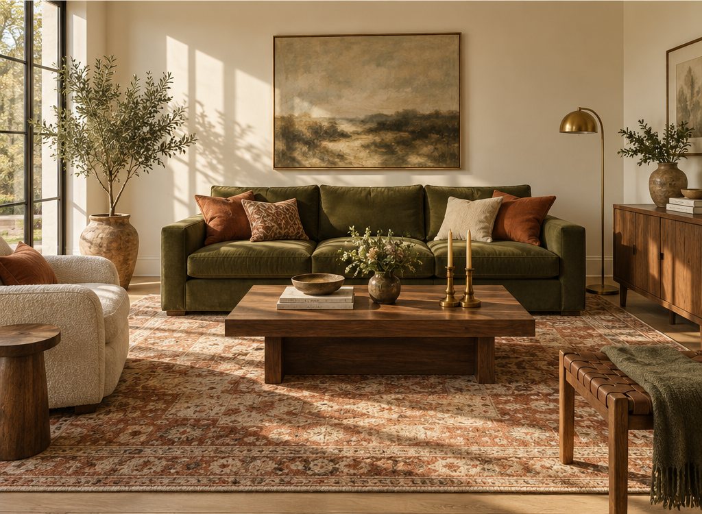
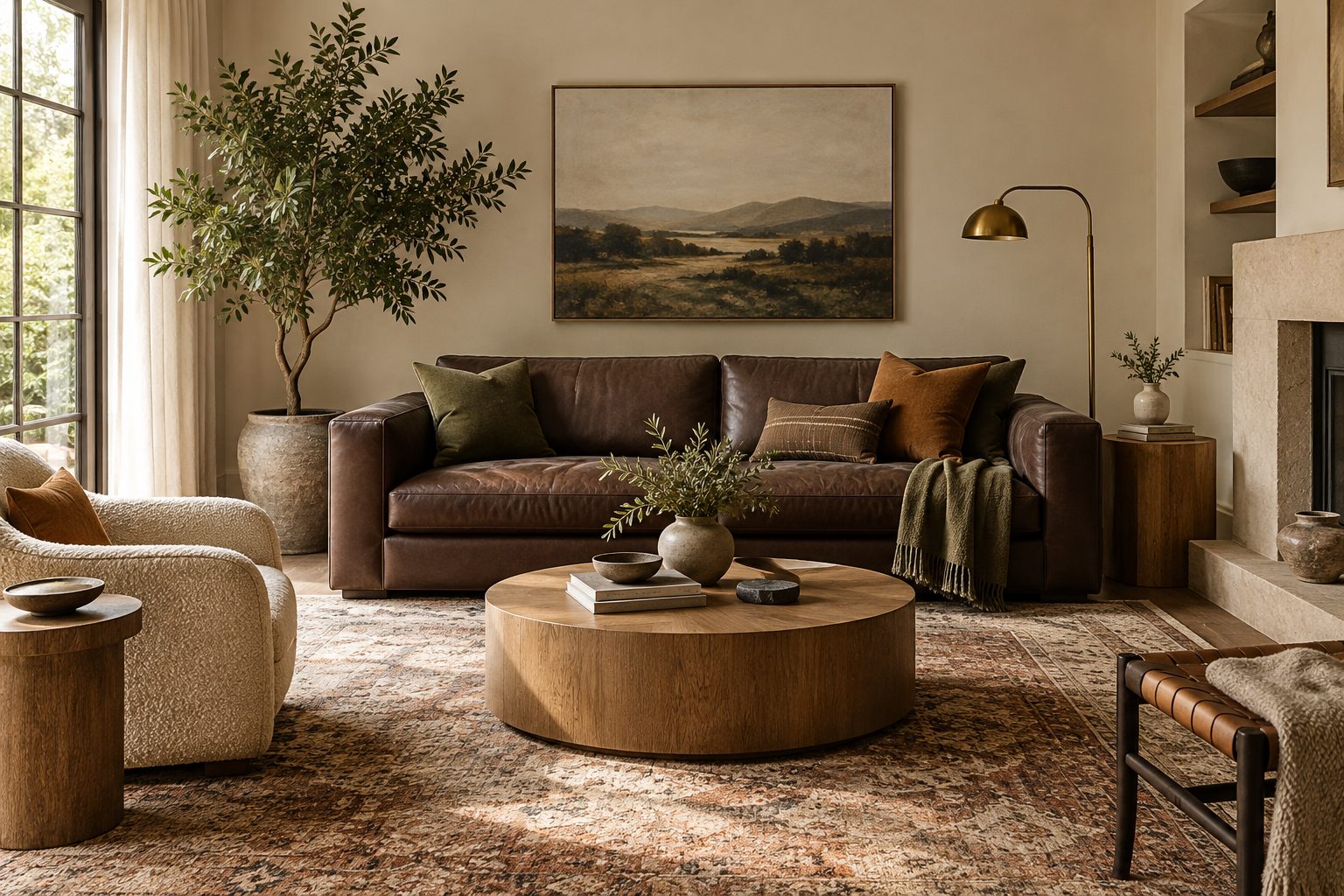
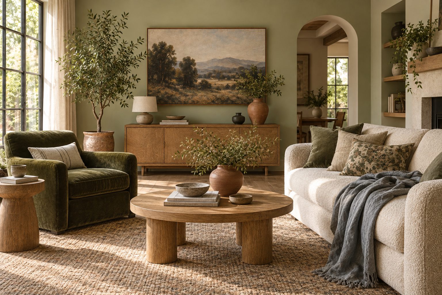
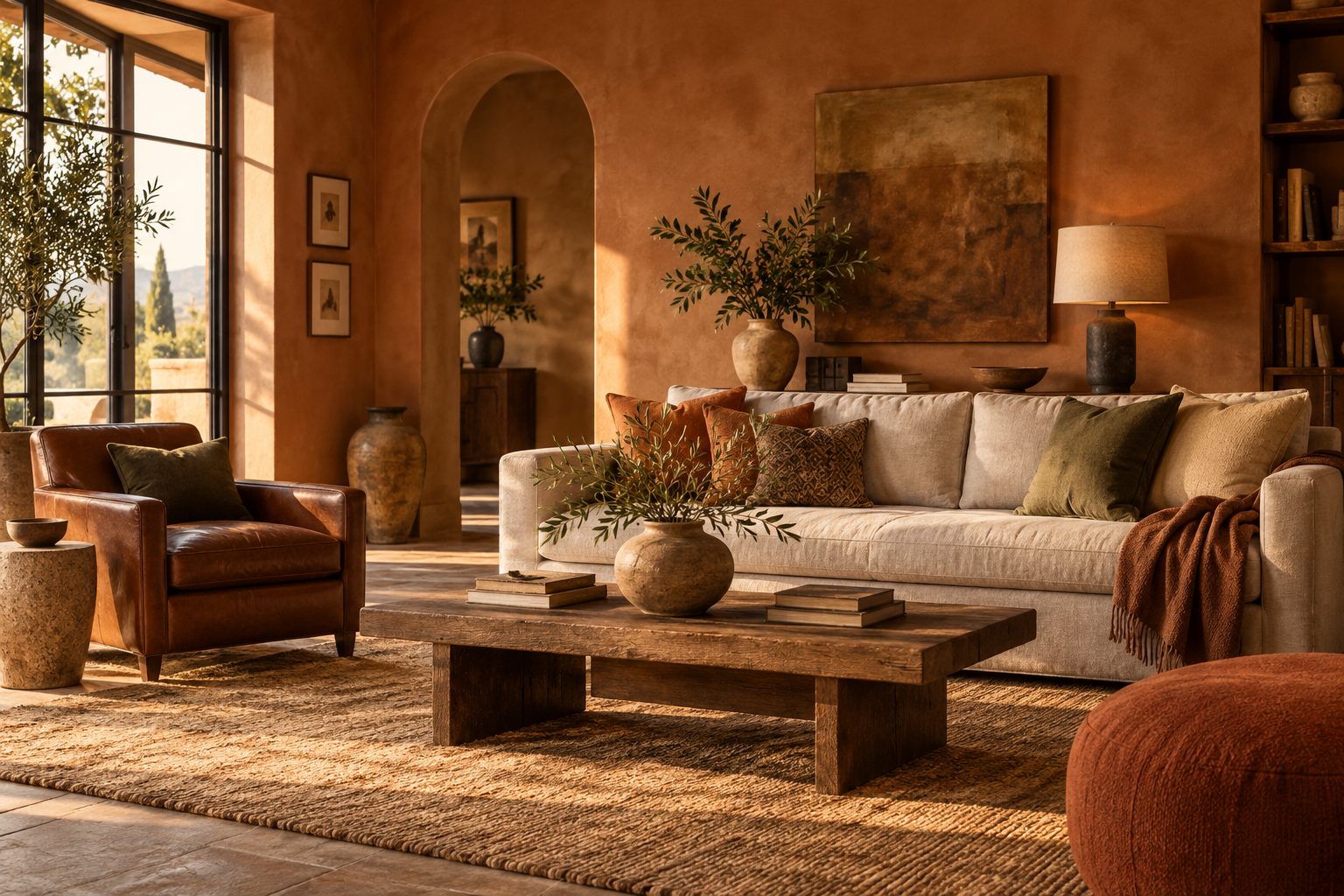
An earth tone living room works when the walls stay light enough to bounce daylight and the depth comes from textiles, wood and one stronger wall or piece. Here is the sequence we use on projects, from the largest surface to the smallest.
- Read the light. Check orientation and window size. North light pushes earth tones gray, so choose bases with a yellow or pink undertone; south light warms everything, so you can use cooler stone and sage.
- Pick the base. Paint walls and ceiling in one light earth tone at LRV 60–80, matte or eggshell. Painting the ceiling the same color, or a 50 percent tint of it, makes the room feel calm and taller.
- Choose one mid tone for a big surface. A clay sofa, an olive built-in or a terracotta rug carries the scheme; resist using two mid tones at the same scale.
- Add the anchor. Umber or brown-black on window frames, a coffee table, picture frames or a leather chair gives the eye a resting point.
- Layer texture. Wool, linen, jute, plaster and unlacquered brass do more than extra color; an earthy room without texture looks flat.
- Light it warm. Use 2700K lamps with CRI 90+. Cool 4000K light turns clay into salmon and olive into khaki.
- Calculate before you buy. Use the paint calculator for wall and ceiling quantities; most rooms need two coats plus a primer when going from white to a mid earth tone.
Are earth tones in style for 2027?
Yes, earth tones are firmly in style for 2027, but the emphasis is shifting from pale beige and greige toward deeper clay, tobacco, olive and oxblood used with more confidence. The neutral-everything look of the early 2020s is giving way to rooms with real color, and earth tones are the bridge, because they read as grown up and timeless even when saturated.
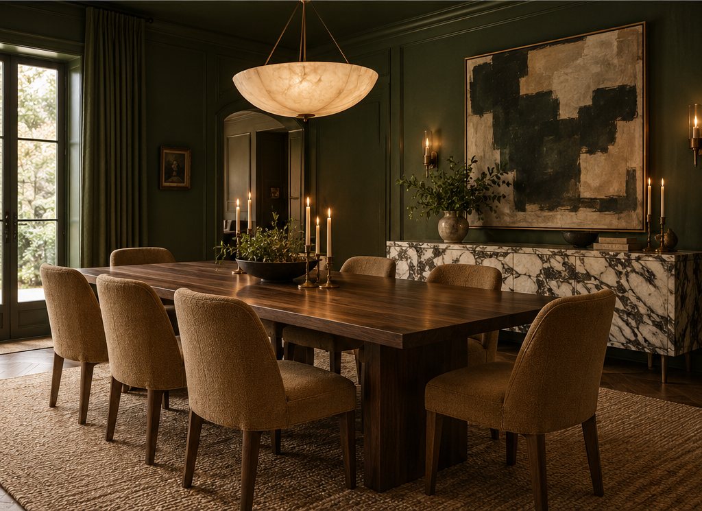
Three movements stand out in our 2027 color palettes forecast. First, color drenching in a single earthy hue, walls, trim and ceiling in one clay or olive, which makes small rooms feel enveloping rather than cramped. Second, brown returning as a main color rather than a wood tone, especially chocolate and tobacco in dens and bedrooms. Third, earthy greens moving into kitchens, replacing the gray and navy cabinets of recent years. What is fading is the cool, flat greige that read as neutral in 2018; it now looks dated next to warmer earthy tones.
Our verdict: how we would build an earthy color palette
If we were choosing an earthy color palette for a typical home today, we would start with a warm bone base throughout, give each room one mid earth tone on a large surface and repeat a single dark anchor across the whole house. That approach keeps the home coherent and makes every room feel related without being identical.
The mistake we see most often is choosing five beautiful earth tones and using them all at similar weight, which produces a room that reads as brown soup. Contrast is what makes earthy colors sing: a light base, a confident mid tone and a crisp dark. The second mistake is ignoring undertone. Terracotta with a pink undertone and olive with a yellow undertone fight each other; keep all mid tones on the same warm side. Sample on two walls, look at them morning and night, and commit only after three days.
If you want the five palettes above as print-ready cards with matched paint, textile and wood references, our palette pack on the store page includes them alongside 40 more schemes for 2027.
Free toolTile CalculatorWork out tiles, boxes, grout and adhesive with the right wastage.Shop & source the look
Buy it today — or have it made
Retail links are affiliate links: we may earn a commission at no extra cost to you (disclosure). “Get it made” sends the item to our sourcing desk for factory quotes in custom sizes and finishes.
Frequently asked questions
What are earth tones?
Earth tones are muted, warm colors drawn from natural pigments such as clay, ochre, umber, sienna and plant dyes. They include terracotta, rust, mustard, olive, moss, sand, taupe and chocolate brown. What they share is a brown or gray undertone and low to medium saturation, which is why they look calm and natural in interiors.
What colors are earth tones?
Earth tone colors fall into five families: clay reds such as terracotta and rust, ochre yellows such as mustard and honey, greens such as olive, moss and sage, browns such as umber, cocoa and tobacco, and stone neutrals such as sand, bone, oat and taupe. Each family runs from a pale tint to a deep shade.
Is black an earth tone?
Black is not a true earth tone because it has no warmth or hue, but a softened brown-black or warm charcoal makes an excellent anchor in an earthy palette. Choose a black with a brown undertone at roughly LRV 3–6 for frames, metalwork or cabinetry, and avoid blue-blacks, which make clay and ochre look dusty.
What colors go with earth tones?
Warm whites, muted blues, deep greens and soft plaster pinks go best with earth tones, along with aged brass, bronze and natural woods. Slate and denim blue are the classic complement to terracotta and rust. Avoid saturated primaries, icy grays and neon accents, which make earthy colors look muddy or dated.
Are earth tones in style for 2027?
Yes. Earth tones remain the warm core of most 2027 palettes, but the direction is deeper: clay, tobacco, chocolate, olive and oxblood rather than pale beige and greige. Expect color drenching in a single earthy hue, brown used as a main wall color, and olive and moss green cabinetry replacing gray in kitchens.
Some links may be affiliate links. Regulations and specifications change — always confirm with suppliers and qualified professionals.