Quiet Luxury Interiors: How to Make a Room Feel Expensive Without Logos
Tailored proportions, exceptional materials and restraint. A practical guide to the understated look clients keep asking for.
Key takeaways
- Tonal palettes and exceptional materials over logos and pattern.
- Tailoring is everything: fit, welting, shadow gaps.
- Spend on what you touch, save on what you look at.
- Warm, layered 2700K lighting completes the look.
Quiet luxury is not a style so much as an attitude: it values craftsmanship over branding, and proportion over decoration. The result is a room that looks calm at first glance and reveals its quality up close, through the weight of a door handle, the depth of a curtain fold or the way stone veining continues across a joint. This guide explains the rules, the materials, where the money should go and how to specify the look for residential and hospitality projects.
Five rules of quiet luxury
- Tonal palettes. Layer shades of one color family: cream, camel, taupe, espresso. Contrast comes from value (light against dark) and texture rather than from competing hues.
- Material over ornament. Let the grain of walnut or the veining of marble be the decoration. If a surface needs applied pattern to be interesting, the material is probably not good enough.
- Tailoring. Custom-fitted curtains that break on the floor, upholstery with precise welting, joinery with shadow gaps. Fit is the single biggest signal of quality.
- Texture in place of pattern. Bouclé, mohair, cashmere-wool blends, suede and raw silk. Several textures in one color family read richer than a patterned fabric.
- Edited objects. A few large pieces instead of many small accessories. One substantial sculpture beats a shelf of trinkets.
The palette
Quiet luxury palettes are warm, deep and restrained. The base is usually a soft cream or greige; the middle values are camel, taupe and mushroom; the anchor is a deep brown, ink or near-black. Use a single accent at most, such as a dusty oxblood or a muted olive, and keep it within the same warm undertone family.
#F1EBE1#D8C7AE#A89582#5B4636#26262BWhere a room already has strong color, such as a dark wood floor or colored stone, build the palette around it rather than fighting it: pick the base, middle and anchor tones from within that material so every surface relates.
Paint in matte or eggshell on walls and satin on woodwork. Color-drenching a small room, where walls, trim and ceiling share one tone, is an effective way to create the enveloping, tailored feel; see our color-drenching guide for how to choose sheens.
Materials that signal quality
- Honed natural stone with book-matched veining. Book-matching mirrors two consecutive slabs so the veining forms a continuous pattern. It costs more in material yield but is instantly recognizable as considered.
- Solid or high-grade veneered walnut and oak. Good veneer on a stable core is often better than solid wood for large panels. What matters is veneer thickness (0.6 mm or more for sanding tolerance), sequence-matching and well-finished edges.
- Brushed or unlacquered brass that patinates over time, bronze and blackened steel for hardware and details.
- Wool and linen blends, heavyweight velvet and leather with a natural, aniline or semi-aniline finish that shows its grain.
- Plaster and limewash walls that add subtle movement without pattern.
Combining materials is where many schemes go wrong. Limit a room to one stone, one or two woods and one metal, and repeat each at least twice so it looks intentional. Contrast smooth with textured: a honed marble top beside a bouclé chair, polished plaster behind a raw linen sofa, a matte walnut table under a softly reflective brass pendant. The eye reads the variety of touch as richness, even though the palette stays narrow.
For more on how these materials behave in daily use, including trade-offs of travertine and bouclé, see our guide to trending materials.
Tailoring details that make the difference
Quiet luxury is decided in millimeters. These are the details to put on drawings and check at sample stage:
| Element | Specify | Why it matters |
|---|---|---|
| Curtains | Ceiling-mounted track, 2.5x fullness, 1–2 cm (0.5–1 in) floor break, interlined | Heavy, even folds read as custom and expensive |
| Upholstery | Self-welting or contrast welting, pattern and nap aligned, tight corners | Poor seams are the first thing trained eyes notice |
| Joinery | Consistent 3–5 mm shadow gaps, integrated handles or solid metal pulls | Clean lines without visible fixings |
| Stone | Mitered edges, book-matched or vein-matched joints, honed finish | Surfaces look like solid blocks |
| Hardware | Solid brass or bronze, weighty lever handles | Touch points communicate quality instantly |
Where to spend and where to save
Spend on the things you touch: sofa, dining chairs, door hardware, bed linen, kitchen worktops. These are handled daily and quickly reveal cheap construction. Save on things you look at from a distance: side tables, decorative accessories, artwork frames. A simple frame around a good print or a well-proportioned side table in a painted finish does not undermine the look.
Also spend on scale. A properly sized rug, a sofa deep enough to lounge on and curtains hung from the ceiling cost more than their smaller versions, but undersized pieces are the most common reason a well-furnished room looks budget. As a rule, a living-room rug should allow at least the front legs of every seat to sit on it; our rug size calculator will do the math for you.
Choosing a sofa that looks expensive
The sofa is usually the largest single purchase and the piece that most defines the room. Look for a kiln-dried hardwood frame with corner blocks, sprung seats or high-resilience foam wrapped in fiber or feather, and seat cushions that recover their shape. Proportion matters as much as construction: a lower back (around 70–75 cm or 28–30 in) and a deep seat look more relaxed and more considered than a tall, boxy frame. Ask for the fabric's rub count and fire certificate, and choose a tight back or a single-piece back cushion if you want the tailored look without constant plumping.
Lighting
Warm light (2700K) from multiple low sources: picture lights, wall washers, table lamps and discreet LED strips in joinery. Avoid a single bright ceiling fixture. Specify CRI 90 or higher so stone, timber and fabric colors render accurately, and hide the source wherever possible: a cove, a recessed profile under a shelf or a deep lampshade. Dimmers on every circuit let the room shift from daytime clarity to an evening glow, which is where quiet-luxury rooms truly come alive.
Room by room
Living room
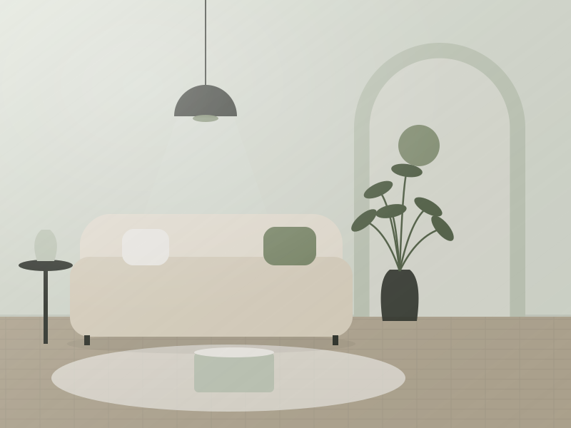
A generous sofa in a textured wool or mohair blend, a stone or solid-wood coffee table with substantial proportions, two deep lounge chairs and a large wool rug. Keep the arrangement symmetrical or nearly so, and let one piece of art or sculpture be the focus. Leave about 45 cm (18 in) between sofa and coffee table and keep main walkways at least 90 cm (36 in) wide, so the room feels generous rather than crowded. Curtains should run from ceiling to floor and extend 15–25 cm (6–10 in) beyond each side of the window frame, which makes windows appear larger.
Dining room
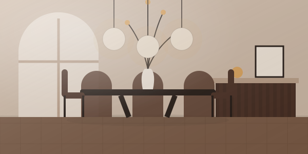
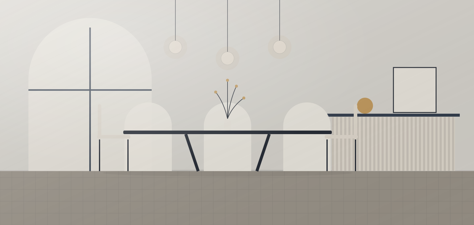
A solid walnut or oak table sized so each diner has 60–70 cm (24–28 in) of width, upholstered chairs with welted seams and a linear or sculptural pendant hung 70–80 cm (28–32 in) above the tabletop. A stone-topped sideboard adds a second material without introducing pattern. Upholstered chairs with arms at each end signal hosting rather than everyday eating; allow 90 cm (36 in) between the table edge and the nearest wall so chairs can be pulled out comfortably.
Bedroom
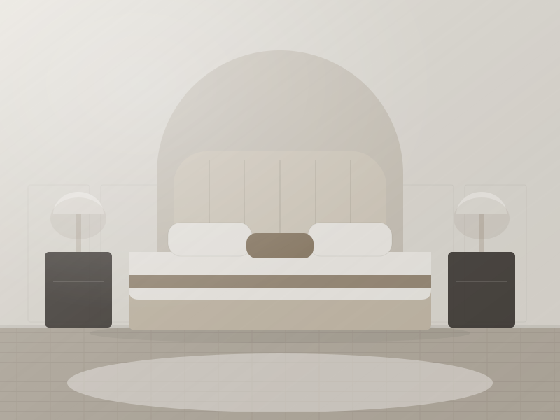
An upholstered headboard that runs wider than the bed, bedding in washed linen or percale in two tones, blackout-lined curtains and wall-mounted reading lights. Keep bedside surfaces nearly bare. A rug that extends 45–60 cm (18–24 in) beyond each side of the bed puts something soft underfoot first thing in the morning, which is exactly the kind of daily sensory detail quiet luxury is built on. Built-in wardrobes with flush, full-height doors and integrated lighting keep clutter completely out of sight.
Bathroom
Honed stone or large-format porcelain with minimal grout joints, brushed brass or nickel fittings, and a timber vanity. Fewer, larger surfaces make even small bathrooms feel generous.
Common mistakes
- Everything beige. Without a deep anchor tone and texture contrast, the look turns bland rather than serene.
- Visible logos and trophy pieces. Recognizable branded objects contradict the whole idea.
- Imitation materials at touch points. Plastic "brass" handles and printed stone laminates break the illusion up close.
- Too many accessories. Edit until each object has breathing room.
- Cold, flat light. A room lit by bright 4000K downlights will never read as warm or refined, however good the furniture.
- Chasing a fleeting look. The point of quiet luxury is longevity; if a piece looks dated in five years, it was the wrong choice.
A practical test before any purchase: would the piece still look right if the room were repainted in a different neutral? If the answer is yes, it has the quality and restraint the style depends on. Pieces that only work with one exact color scheme tend to date quickly.
For hospitality projects
Quiet luxury translates especially well to boutique hotels and serviced apartments, where it ages gracefully and photographs well. Durability matters: specify contract-grade fabrics with suitable rub counts (often 40,000 Martindale or more for public areas) and fire ratings for your market, performance finishes on timber and sealed stone in wet zones. Removable covers and standardized hardware make maintenance easier. Our hotel FF&E sourcing guide covers specification and procurement in detail.
Free toolCurtain Size CalculatorRod length, panel size, ready-made match and yardage.Shop & source the look
Buy it today — or have it made
Retail links are affiliate links: we may earn a commission at no extra cost to you (disclosure). “Get it made” sends the item to our sourcing desk for factory quotes in custom sizes and finishes.
Frequently asked questions
What is quiet luxury in interior design?
Quiet luxury is an understated approach that relies on exceptional materials, tailored proportions and tonal palettes instead of logos, bold pattern or decoration. Quality is revealed in the details and the way a room feels to use.
How can I make a room look expensive on a budget?
Invest in the things you touch every day, such as seating, hardware and bedding, and in correct scale for rugs and curtains. Save on accessories and items viewed from a distance, and remove clutter.
Which colors are used in quiet luxury interiors?
Tonal warm neutrals such as cream, camel, taupe and espresso, often anchored with ink or near-black. Any accent color is muted and shares the same warm undertone.
Does quiet luxury work for hotels?
Yes. Its tonal palette and durable natural materials age well and photograph consistently, provided fabrics and finishes are contract grade with suitable abrasion and fire ratings.
Some links may be affiliate links. Regulations and specifications change — always confirm with suppliers and qualified professionals.