Interior Design Trends 2027: 12 Directions Shaping the Year
Warmer minimalism, sculpted curves, characterful stone and color used as a mood rather than an accent — the ideas designers are carrying into 2027.
Key takeaways
- Minimalism warms up with tactile, natural materials.
- Brown replaces grey as the default neutral.
- Curves turn organic and asymmetric.
- Traceable, longer-lasting materials become a procurement requirement.
Trend forecasts are most useful when they describe a direction rather than a fad. The twelve ideas below are the ones we see repeatedly across designer portfolios, hospitality openings, trade fairs and the product briefs we receive from buyers. Each comes with a note on how to apply it, where it works best, what you would actually need to buy or specify — and the mistake that makes it look dated fastest.
1. Warm minimalism grows up
The stark white box is gone. In its place: rooms with very few objects, but every surface carries warmth — limewashed walls, oiled oak, wool, linen and stone with visible grain. The discipline of minimalism stays; the coldness does not.
How to use it: reduce the number of materials in a room to three or four, then make each one tactile. Swap gloss for matte and chrome for brushed or patinated metal. Hide storage behind flush joinery and let one large piece — a long oak console, a stone bench — replace a dozen accessories.
Where it works: living rooms, primary bedrooms and hotel guest rooms, where calm is the brief. What to specify: matte or eggshell mineral paint, oiled rather than lacquered timber, wool or linen upholstery and a single natural stone. Pitfall: warm minimalism relies on flawless execution. Wavy plaster corners, visible cable runs and gappy joinery are far more noticeable in a room with nothing to distract the eye, so budget for workmanship before objects.
2. Brown is the new neutral
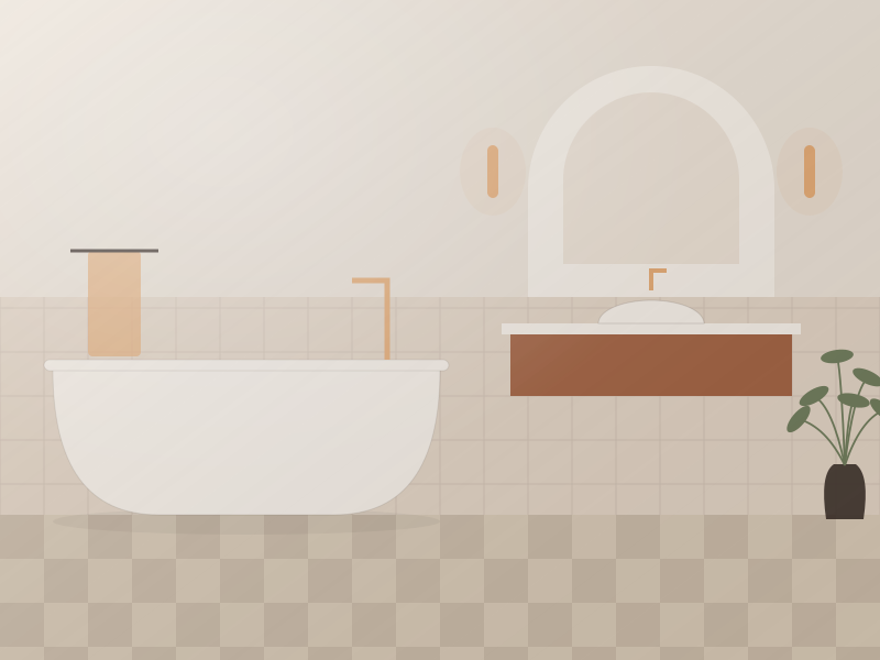
Chocolate, espresso, tobacco and mushroom are replacing gray as the default backdrop. Brown flatters skin tones, pairs with every wood species and makes brass and cream feel richer. Expect brown upholstery, brown-lacquered joinery and even brown-veined stone.
#EFE3D6#B99D86#8A6A52#5A3B2C#2B1B18How to use it: start with a mid-tone such as mushroom or tobacco on large surfaces and save the darkest browns for joinery, a sofa or a painted ceiling. Brown needs contrast to read as intentional, so pair it with cream textiles, pale stone or aged brass. In north-facing rooms, choose browns with a red or pink undertone; greener browns can turn muddy in cool light.
Where it works: dining rooms, snugs, studies and hotel bars — anywhere you want enclosure. Pitfall: too many browns of similar value flatten a room. Vary the depth by at least a few shades from wall to sofa to floor, and add texture (bouclé, velvet, grainy oak) so the scheme does not read as a single beige-brown block. Our 2027 color palettes include a full cocoa-based scheme with hex codes.
3. Curves everywhere
Arched doorways, pill-shaped mirrors, rounded sofas and bullnose countertops continue to soften interiors. The 2027 evolution is asymmetry: organic, pebble-like outlines rather than perfect circles.
How to use it: introduce curves at two or three scales — a rounded sofa, an oval coffee table, a pill mirror — and keep the architecture mostly straight so the curves have something to play against. A curved sofa needs more floor area than a straight one of the same seat count; allow roughly 36 in / 90 cm of clear walkway around it and at least 18 in / 45 cm between the sofa front and the coffee table.
What to specify: for curved upholstery, ask for a plywood or bent-laminate frame, high-resilience foam and a fabric that follows radii without puckering. Pitfall: curved pieces against a flat wall waste space and look stranded. Float them in the room or pair them with a curved rug.
4. Stone with character
Travertine, honed limestone, fluted marble and bold-veined quartzites are showing up beyond the bathroom — as coffee tables, lamp bases, shelving and even full wall cladding. Unfilled travertine, with its open pores, is the signature look.
How to use it: choose one stone per room and let it appear in two places — a coffee table and a lamp base, or a vanity top and a shelf. Honed and leathered finishes feel more current than high polish and hide wear better. For furniture, a solid stone top typically runs about 3/4–1 1/4 in / 20–30 mm thick; anything thinner needs a supporting substrate.
What to ask a supplier: the stone name and quarry origin, whether it is vein-cut or cross-cut, whether pores are resin-filled, the finish, and photos of the actual block or slab. Pitfall: travertine and marble etch on contact with acids such as citrus and wine. On dining and kitchen surfaces, either accept patina or choose quartzite. Our trending materials guide covers care in detail.
5. Handcrafted and imperfect
Hand-thrown ceramics, uneven zellige tiles, hand-knotted rugs and visible joinery signal authenticity in a market saturated with flat-pack. Buyers are asking suppliers for "hand-made look" finishes even in production runs.
How to use it: pick a few pieces where the hand of the maker is obvious — a lamp with a hand-glazed base, a rug with slight irregularities, a tile with variable glaze — and surround them with calm, precise surfaces so the imperfection reads as deliberate. For tiles, lay handmade zellige with tight joints of around 1/16 in / 1–2 mm and expect lippage; that unevenness is the look.
Where it works: kitchens, bathrooms, restaurant interiors and anywhere that benefits from character. Pitfall: "imperfect" still needs a quality standard. Agree on acceptable variation in writing — color range, size tolerance, glaze pinholes — and approve a sample panel before bulk production.
6. Fluting, reeding and ribbing
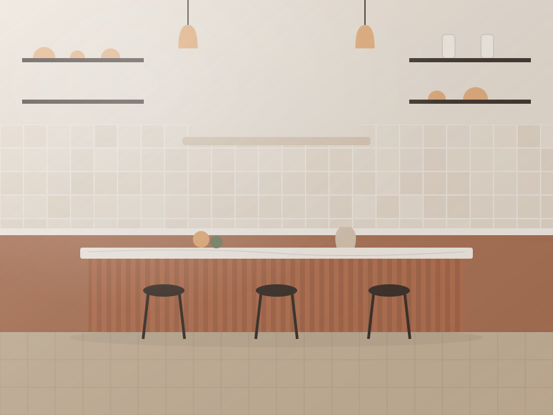
Linear relief brings shadow and rhythm to cabinetry, kitchen islands, lighting and glass. It remains one of the most requested details in custom furniture briefs — and one of the easiest to specify.
How to use it: apply it to one element per room: an island front, a headboard wall, a sideboard or a glass partition. Flute width changes the character — narrow reeds of about 3/8 in / 10 mm feel refined and contemporary, while wider flutes of 3/4–1 in / 20–25 mm read as more classical and Art Deco. Specify the profile (half-round, square or V-groove), the spacing and whether it runs vertically or horizontally.
What to specify: solid timber for edges that get knocked; lacquered MDF for large, stable painted panels; reeded or fluted glass for doors and shower screens that need privacy without losing light. Pitfall: grooves collect dust and grease. Avoid deep fluting at hand height in kitchens, and never mix three different flute sizes in one space.
7. Sculptural, layered lighting
Ceiling downlights alone are out; layered lamps are in. Look for oversized paper and fabric pendants, alabaster-effect wall lights, mushroom table lamps and rechargeable cordless lamps that move from table to terrace.
How to use it: plan at least three light sources at different heights in every living space — ceiling, eye level and low — and put them on separate circuits or dimmers. A sculptural pendant carries the decorative layer; wall lights and table lamps do the mood work in the evening. Keep color temperature consistent, typically 2700K in living spaces, and specify CRI 90 or above so timber and textiles look right.
What to buy: one statement pendant, a pair of wall lights with dimmable drivers and at least one portable lamp. Pitfall: sculptural fittings chosen for looks alone often produce glare. Check that the lamp is shielded from normal sightlines. Our step-by-step guide to layering lighting covers lux levels and dimming.
8. Color drenching
Walls, trim, ceiling and sometimes upholstery in a single color — or tones of the same hue — create enveloping, gallery-like rooms. It works especially well in small spaces such as powder rooms, studies and hallways.
How to use it: choose a mid- to deep tone and apply it to every surface, varying only the sheen: matte on walls and ceiling, eggshell or satin on trim and doors for durability. Estimate quantities carefully — ceilings and trim add more area than most people expect; our paint calculator helps.
Where it works: rooms with little architectural detail, where drenching hides awkward angles and blurs boundaries. Pitfall: a single flat color with no texture can feel like a box. Layer in timber, metal or a patterned rug.
9. Hotel-at-home
Residential clients increasingly brief designers with photos of boutique hotels: walk-in showers, upholstered headboard walls, bedside niches, and bathrooms with the calm of a spa. The crossover also runs the other way, with hotels becoming more residential.
How to use it: borrow the details that make hotel rooms work — wall-mounted bedside lights with individual switches, a bench at the foot of the bed, a luggage or dressing zone, blackout lining, and a bathroom with one excellent shower rather than a crowded suite of fixtures. A king bed ideally needs around 30–36 in / 75–90 cm of clearance on each side for bedside tables and circulation.
What to specify: contract-grade details at home — high rub-count fabrics, blackout linings, solid-surface or stone vanities and dimmable scene lighting. Pitfall: copying a hotel literally can make a home feel impersonal. Keep the planning and the performance; add personal art, books and vintage pieces. For the professional side of the crossover, see our hotel FF&E sourcing guide.
10. Biophilia beyond houseplants
Natural light, natural ventilation, organic shapes and raw materials are now treated as design fundamentals, not decoration. Rattan, cane, jute, cork and wood with visible knots all support the idea.
How to use it: start with the architecture — keep window zones clear, arrange seating to face the view, use sheer curtains that filter rather than block daylight. Then layer natural materials at touch points: cane cabinet doors, a jute or wool rug, cork on a study wall, a solid timber table.
Pitfall: natural fibers such as rattan and jute do not suit wet or very dry environments without care. Specify synthetic alternatives for outdoor terraces and pool areas.
11. Traceable, longer-lasting materials
Certifications such as FSC for wood, recycled content and low-emission finishes are moving from nice-to-have to procurement requirement — particularly for hospitality and commercial projects.
How to use it: write the requirements into the specification rather than asking later. For timber, request chain-of-custody certification numbers. For panel products, ask for formaldehyde emission compliance for your market (for example CARB Phase 2 / TSCA Title VI in the US, or E1 in Europe). For upholstery, request flammability certificates such as TB 117-2013 for US residential or the relevant BS or EN tests for the UK and Europe.
What to buy: fewer, better pieces with replaceable parts — removable covers, re-upholsterable frames, modular sofas and lamps with standard, replaceable light sources. Pitfall: a certificate is only useful if it covers the actual product and batch. Check that the company name and product on the certificate match your supplier.
12. Mixing eras
A 1970s travertine table next to a contemporary bouclé chair and an antique rug: rooms that look collected over time feel more personal than a single-catalog scheme. Vintage-inspired reproductions are a fast-growing product category.
How to use it: anchor the room in one era, then add pieces from two others. Tie them together with a shared element — a repeated wood tone, a consistent metal finish or a restricted palette. A useful ratio is roughly two-thirds contemporary to one-third vintage, or the reverse, but never an even split, which can look indecisive.
Where it works: living and dining rooms, restaurants and boutique hotels that want a sense of place. Pitfall: mixed eras need consistent proportions. A heavy Victorian cabinet will swamp a slim mid-century sofa.
How to apply the trends without dating a room
- Invest in the long-lived layer: put flooring, kitchens, stone and built-in joinery into warm neutrals and quality materials, which will outlast any trend cycle.
- Express trends in the changeable layer: use color, pattern and shape in paint, textiles, lighting and accessories that can be updated without demolition.
- Choose one or two trends per room: a curved sofa and a stone table, for example — rather than all twelve.
- Prioritize quality over quantity: one solid oak table beats three veneered side tables. Sample stone, fabric and finishes together in the room before committing.
If you are unsure which directions suit your space, the style quiz is a quick starting point, and our online design service can turn a trend board into a buildable plan. Want the full picture in one file? Download the 2027 Interior Trend Report with palettes, materials and sourcing notes.
What is fading in 2027
Several looks are losing momentum: cool gray-on-gray schemes, all-white high-gloss kitchens, matching furniture sets from a single collection, black metal framing used everywhere at once, and grids of cool-white downlights. None needs ripping out — warmer lighting, added texture and one or two of the directions above usually bring a room forward.
Free toolTile CalculatorWork out tiles, boxes, grout and adhesive with the right wastage.Shop & source the look
Buy it today — or have it made
Retail links are affiliate links: we may earn a commission at no extra cost to you (disclosure). “Get it made” sends the item to our sourcing desk for factory quotes in custom sizes and finishes.
Frequently asked questions
What are the biggest interior design trends for 2027?
The strongest directions are warm minimalism, brown as a neutral, organic curves, characterful stone, handcrafted pieces, fluting, layered sculptural lighting, color drenching, hotel-at-home details, biophilia, traceable materials and mixing eras.
Is gray still in style for 2027?
Cool gray is fading as a default backdrop. Warm neutrals such as mushroom, taupe and chocolate brown are replacing it, though warm grays with a beige undertone still work well alongside stone and oak.
How many trends should I use in one room?
One or two per room is usually enough. Put trends into paint, textiles and lighting, and keep long-lasting investments such as flooring and kitchens in warm, durable neutrals.
Which 2027 trends are easiest to apply on a budget?
Color drenching, layered lamp lighting and textile changes deliver the most impact for the least cost, because they need no construction work and can be updated later.
Some links may be affiliate links. Regulations and specifications change — always confirm with suppliers and qualified professionals.