Dopamine Decor: What It Is, Colors and How to Make It Grown Up
Dopamine decor is decorating with bold color, pattern and personal objects chosen purely because they make you happy. In 2027 it is maturing from candy brights toward deeper, saturated color used in 2–3 confident doses per room.
Part of our guide: Interior Design Trends 2027: 12 Directions Shaping the Year
Key takeaways
- Dopamine decor means decorating with color, pattern and objects that give you personal joy; the name is a marketing label, not a neurological claim
- Dopamine colors are saturated, clear hues: tomato red, marigold, emerald, cobalt, bubblegum pink and tangerine, grounded by a warm white
- Keep it grown up with one dominant color per room, a 60-30-10 split, solid materials and fewer, better objects
- In 2027 the trend shifts from playful brights toward deeper saturated color: oxblood, ochre, bottle green and ink
Dopamine decor is a way of decorating with bold color, pattern and personal objects chosen purely because they make you happy. It is maximalism with a feel-good label: saturated hues such as marigold, tomato red, emerald and cobalt, used confidently. The name is marketing, not science. Done well, with one dominant color and 2–3 accents per room, it looks joyful rather than childish.
The dopamine decor trend took off as a reaction to years of beige, gray and greige, and it has been one of the most searched decorating ideas since. This article is part of our interior design trends 2027 guide, and it covers what the style is, which colors define it and how it is evolving into something calmer and more sophisticated.
- Definition: decorating with color and objects that personally delight you, rather than following a neutral or resale-safe formula.
- Typical palette: 2–4 saturated hues plus a warm white or soft neutral to rest the eye.
- Typical ratio: 60 percent dominant color or neutral, 30 percent secondary, 10 percent accent.
- Science check: no paint color chemically raises dopamine; the benefit is personal enjoyment and expression.
- 2027 direction: deeper saturated color, color drenching and fewer, better statement pieces.
What is dopamine decor?
Dopamine decor is an interior style built on personal joy: bright or saturated color, playful pattern, curvy shapes and meaningful objects, chosen because they make you feel good rather than because they are on trend or neutral for resale. It sits within maximalism, but where classic maximalism layers antiques and pattern, dopamine decorating leans on clear, cheerful color and contemporary pieces.
Signature elements of dopamine design include color-blocked walls and doors, painted ceilings, rounded and squashy dopamine furniture, glossy ceramics, checkerboard and stripe patterns, colored glass, and art and objects with a story. A dopamine home decor scheme often looks like it belongs to one specific person, and that is the point: it rejects the anonymous showroom look in favor of character.
The term spread through social media around 2022, borrowed from "dopamine dressing" in fashion. It is a convenient label rather than a defined design movement, so there are no rules beyond the one in the name: if it does not make you happy, it does not belong.
Does dopamine decor actually boost dopamine?
No paint color or object has been shown to chemically raise dopamine levels; "dopamine" here is a marketing label for decorating that brings you personal pleasure. Color psychology research is real but modest and inconsistent, with responses varying widely by culture, age and individual association.
What is well supported is simpler and more useful. People tend to feel better in rooms that have good daylight, comfortable temperature, low clutter, pleasant acoustics and things they find meaningful. A yellow you love may lift your mood because it reminds you of a summer house, not because yellow is inherently uplifting; someone else may find the same yellow irritating. We would rather you judge the style on that honest basis: decorate with what you genuinely enjoy, and let the name be shorthand for that idea.
What colors are dopamine colors?
Dopamine colors are clear, saturated hues with high chroma: tomato red, marigold yellow, emerald and teal, cobalt and violet-blue, bubblegum and coral pink, and tangerine orange, usually grounded by a warm white. They are the opposite of the muted, gray-tinted shades that dominated interiors from roughly 2012 to 2022.
#E2574C#F2B33D#2F7D6D#5B5FC7#E99AB4#F4EBDD| Palette | Dominant (60%) | Secondary (30%) | Accent (10%) | Mood |
|---|---|---|---|---|
| Sunny | Warm white #F4EBDD | Marigold #F2B33D | Cobalt #3C5FC2 | Bright, energetic, kitchen-friendly |
| Candy | Pale pink #F3D3D6 | Tomato #E2574C | Mint #9ED9C2 | Playful, best in small doses |
| Jewel | Emerald #2F7D6D | Fuchsia #C2407A | Ochre #C99A3A | Rich, evening, living rooms |
| Riviera | Warm white | Cobalt #3C5FC2 | Tangerine #EE7A35 | Fresh, Mediterranean |
| Grown-up 2027 | Oxblood #6E2A2A | Ochre #B8862F | Bottle green #234A3D | Deep, saturated, timeless |
Saturated colors read darker and stronger on a wall than on a chip, especially in large areas. Test a 24 × 24 in (61 × 61 cm) sample and, for walls, consider knocking the chosen color back 10–20 percent in strength. Light at 2700–3000K with CRI 90+ keeps reds and yellows from going muddy at night. More combinations live in our palette library.
How do you do dopamine decor without it looking childish?
Dopamine decor looks grown up when color is planned rather than scattered: one dominant hue per room, a 60-30-10 split, solid materials and fewer, better objects. It looks childish when every color appears at once in small plastic doses. These are the steps we use.
- Pick one lead color per room. Let it cover a big plane: walls, a sofa, cabinetry or a rug. Big, confident color looks deliberate; dozens of small colorful things look like a toy box.
- Use the 60-30-10 rule. 60 percent dominant (color or warm neutral), 30 percent secondary, 10 percent accent. It is a starting point, not a law, but it prevents chaos.
- Choose complex versions of bright hues. Tomato rather than fire-engine red, marigold rather than lemon, teal rather than primary green. A drop of brown or gray adds maturity.
- Invest in material quality. Lacquer, glazed ceramic, wool, velvet, colored glass and solid wood carry color with dignity; thin plastic and shiny polyester do not.
- Repeat each color at least three times. A blue sofa, a blue print and a blue vase across the room make blue a theme rather than an accident.
- Give the eye somewhere to rest. A warm white ceiling, a wood floor or a calm rug balances the energy.
- Edit objects ruthlessly. Keep the things you love, display them in groups of three or five, and leave clear surfaces between groups.
Dopamine decor ideas by room
The best dopamine decor ideas put the strongest color in rooms you use for socializing or short periods, and calmer saturated tones where you need rest.
Dopamine decor living room
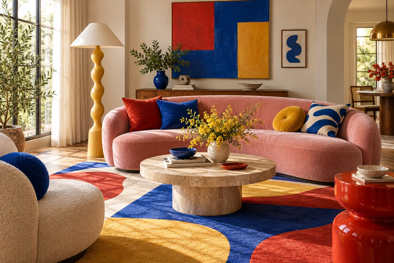
Choose one statement: a cobalt or emerald velvet sofa, a painted ceiling or a large saturated rug. Pull two accent colors into pillows, art and a lamp. A dopamine decor living room benefits from curved, low furniture and a glossy ceramic or colored glass lamp; 2700K light makes the room glow in the evening.
Bedroom
Keep the energy lower. Use a deep, saturated color such as oxblood, bottle green or ink as a full drench, then add pattern in bedding. Bright yellow or tomato red behind the bed is lively by day and tiring at night.
Kitchen and dining
Color the cabinetry, the island or the dining chairs. Painted lower cabinets in marigold or teal with warm white uppers is cheerful and practical. A colored zellige or glazed tile backsplash adds gloss and movement.
Home office and hallways
Small rooms are the safest place to experiment. A fully drenched hallway in tomato or a cobalt study takes 1–2 gallons (4–8 liters) of paint and can be changed in a weekend.
Renter-friendly dopamine decor ideas
You do not need to repaint to get the effect. The changes below deliver strong color and are easy to reverse when you move out:
- A large saturated rug: 8 × 10 ft (244 × 305 cm) of color covers more visual area than any paint job you are not allowed to do.
- Colored lampshades and bases: pleated or glazed shades in coral, marigold or teal glow at night and cost little.
- Slipcovers and throws: a removable cover turns a neutral sofa into dopamine furniture for a fraction of a new piece.
- Removable wallpaper or a painted headboard panel: a single plane of pattern behind the bed or desk.
- Oversized art: one 36 × 48 in (91 × 122 cm) canvas in your lead color anchors a whole wall.
Can you do minimalist dopamine decor?
Yes: minimalist dopamine decor uses one saturated color across a large surface in an otherwise calm, uncluttered room, so the joy comes from the color itself rather than from many objects. It suits people who love color but hate clutter.
The formula is a single color drench, walls, trim and sometimes ceiling in one hue, plus pale wood, a white or natural rug and a few sculptural pieces. A tangerine bedroom with oak furniture and linen bedding, or a cobalt bathroom with white fixtures, is as clean as any minimalist room but far more memorable. Our color drenching guide covers how to paint every surface in one shade without the room closing in.
Is dopamine decor still in style in 2027?
Yes, but it is maturing: in 2027 dopamine decor is moving from playful candy brights toward deeper, grown-up saturated color such as oxblood, ochre, bottle green, ink and burnt orange, used with more restraint. The appetite for color is still strong; the sugar is being dialed down.
Three shifts define the direction. First, saturation without brightness: colors are as strong as before but darker and more complex. Second, color drenching instead of color scattering, one hue across a whole room rather than a rainbow of accessories. Third, better materials, with lacquer, glazed tile, velvet and colored stone replacing novelty objects. Our 2027 color palettes forecast tracks these shades in detail. What is fading is the checkerboard-everything, squiggle-mirror, pastel-plastic version of the style that defined its first wave.
Our verdict on dopamine decorating
We like dopamine decorating when it is honest: a home full of colors and objects its owner genuinely loves, planned around one strong idea per room. We are less keen on it as a shopping list of trending novelty pieces, which date within two years.
How we would do it in a typical living room: keep the floor and ceiling calm, put the strongest color on the largest soft piece, usually the sofa or rug, and pick two supporting colors from a single artwork you already own. That way the palette is personal by definition, and the room feels like yours rather than like a trend.
The mistake we see most often is adding color in small, cheap increments, colored cushions, a neon sign, a patterned tray, until the room looks busy but not joyful. The better route is to make one bold decision per room that would be hard to undo, such as a painted ceiling or a colored sofa, then build calmly around it. If you are unsure whether color suits you at all, our style quiz is a quick way to find out.
Want the palettes above as ready-to-use color cards? Our palette pack in the store includes dopamine and grown-up saturated schemes for 2027 with matched paint, textile and finish references.
Free toolTile CalculatorWork out tiles, boxes, grout and adhesive with the right wastage.Shop & source the look
Buy it today — or have it made
Retail links are affiliate links: we may earn a commission at no extra cost to you (disclosure). “Get it made” sends the item to our sourcing desk for factory quotes in custom sizes and finishes.
Frequently asked questions
What is dopamine decor?
Dopamine decor is a decorating style built on bold color, pattern and personal objects chosen because they make you happy. It is a cheerful form of maximalism that favors saturated hues, curvy furniture and meaningful pieces over neutral, resale-safe schemes. The name is a marketing label borrowed from dopamine dressing, not a scientific claim.
Is dopamine decor still in style in 2027?
Yes, but it is maturing. In 2027 the style is moving away from candy brights and novelty objects toward deeper saturated colors such as oxblood, ochre, bottle green and ink, often used as a full-room color drench. The appetite for color remains strong; the execution is calmer, with better materials and fewer accessories.
How do you do dopamine decor without it looking childish?
Choose one lead color per room and apply it to a large surface such as walls, a sofa or cabinetry. Follow a 60-30-10 split, use complex versions of bright hues such as tomato or marigold, invest in solid materials like lacquer, velvet and glazed ceramic, repeat each color three times and edit objects into small groups.
What colors are dopamine colors?
Dopamine colors are clear, saturated hues with high chroma: tomato red, marigold yellow, emerald and teal, cobalt and violet-blue, bubblegum or coral pink, and tangerine orange. They are usually grounded with a warm white or soft neutral. For a more grown-up 2027 version, use deeper shades such as oxblood, ochre and bottle green.
Does dopamine decor really boost your mood?
No paint color has been shown to chemically raise dopamine, so the name is a label rather than a promise. People do tend to feel better in rooms with good daylight, low clutter and objects they find meaningful, so decorating with colors and pieces you personally love can make a home more enjoyable to live in.
Some links may be affiliate links. Regulations and specifications change — always confirm with suppliers and qualified professionals.