Color of the Year 2027: Every Paint Brand's Pick So Far, Explained
There is no single color of the year 2027: as of October 2026, 10 brands and forecasters have named picks, led by greens like Sherwin-Williams Celery and Behr Grounded. Every pick, code and pairing is here.
Part of our guide: 2027 Color of the Year and Palettes: Earth, Cocoa, Butter and Ink
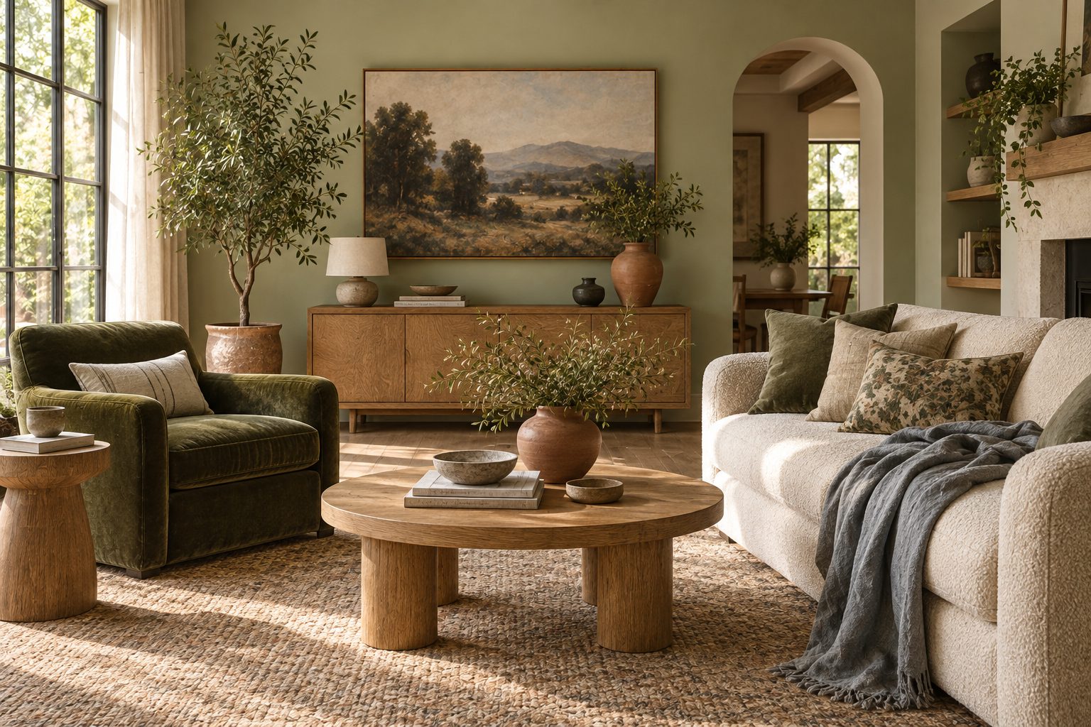
Key takeaways
- As of 9 October 2026, 10 paint brands and forecasters have announced a 2027 color of the year; Benjamin Moore and Pantone have not yet
- Sherwin-Williams chose Celery, SW 6421, a crisp light green with warm yellow undertones; Behr chose Grounded, a deep mossy olive
- Greens dominate the 2027 picks, followed by muted blues, warm earthy browns and terracotta-to-rose earth tones; gray is absent
- Use the pale picks on walls and the deep picks on cabinetry, doors or a single drenched room, and test every sample in your own light
The color of the year 2027 is not one color. As of 9 October 2026, ten paint brands and forecasters have named a pick, and most of them are green: Sherwin-Williams chose Celery (SW 6421), Behr chose Grounded (T27-01) and Dulux chose Soulful Sage. Muted blues, warm browns and terracotta fill out the list. Benjamin Moore and Pantone have not announced yet, and this page will be updated when they do.
Every autumn the paint industry publishes its forecasts for the following year, and searches for the 2027 color of the year will peak between November and February. Today is October 2026, so what follows separates what has been announced from what is still forecast. This page is part of our 2027 color palettes guide, which turns these picks into complete whole-house schemes.
- Announced so far: 10 picks, from Sherwin-Williams, Behr, Valspar, Dulux, PPG / Glidden, Dutch Boy, C2 Paint, Graham & Brown, Little Greene and WGSN x Coloro.
- Not yet announced: Benjamin Moore (its site says "coming this October") and Pantone (traditionally early December).
- Dominant family: green, in three strengths: pale celery, mid sage and deep olive.
- What is missing: cool gray. Every 2027 pick is either warmed with yellow, brown or rose, or softened toward blue.
- Last year for context: 2026 picks included a soft white, a khaki, a burnt umber charcoal, a smoky jade and a eucalyptus green.
What is the color of the year for 2027?
The color of the year for 2027 depends on the brand, but the shared answer is green: four of the ten announced picks are greens, and most of the rest are warm earth tones or muted blues. Each company runs its own forecasting process, so the colors of the year 2027 are best read as a group. The table below lists every pick confirmed as of 9 October 2026, with our notes on where each one works and what it pairs with.
| Brand | Color | Code | Family | Undertone | Best rooms | Pairs with |
|---|---|---|---|---|---|---|
| Sherwin-Williams | Celery | SW 6421 | Light green | Warm yellow | Kitchens, breakfast rooms, bathrooms | Warm white, oak, unlacquered brass |
| Behr | Grounded | T27-01 | Deep olive green | Brown | Studies, dining rooms, cabinetry | Cream, walnut, aged brass, rust |
| Valspar | Cottage Door | 8004-38E | Powder gray blue | Balanced warm and cool | Bedrooms, front doors, bathrooms | Ivory, rattan, pale oak, nickel |
| Dulux | Soulful Sage | Not listed here | Pale heritage green | Gray-green | Living rooms, bedrooms, hallways | Linen white, stone, terracotta |
| PPG / Glidden | Artifact | PPG10-16 | Muted blue gray | Cool, softened | Bedrooms, home offices, exteriors | Warm white, walnut, leather |
| Dutch Boy | Deep Rooted | Not listed here | Terracotta | Orange | Dining rooms, accent walls, exteriors | Cream, olive, raw wood |
| C2 Paint | Pueblo | Not listed here | Warm brown | Rose | Dens, powder rooms, drenched rooms | Plaster pink, oxblood, brass |
| Graham & Brown | Rose Earth | Not listed here | Dusty pink | Terracotta, plaster | Bedrooms, living rooms | Sage, warm white, linen |
| Little Greene | Marle | Not listed here | Whisper-soft brown | Warm | Whole-house neutral, ceilings | Every pick on this list |
| WGSN x Coloro | Luminous Blue | Coloro 125-28-38 | Blue (forecaster pick) | Bright, clear | Accents, textiles, art | Warm neutrals, soft brown |
"Not listed here" means we only publish codes we have verified; check the brand's own fan deck before ordering. WGSN x Coloro is a trend forecaster rather than a paint maker, so its Luminous Blue is a direction for products and textiles, not a can of paint.
What is Sherwin-Williams color of the year 2027?
Sherwin-Williams color of the year 2027 is Celery, SW 6421, a crisp light green with warm yellow undertones that reads fresh and calm rather than sharp. It is a big change from the brand's 2026 pick, Universal Khaki SW 6150, and it confirms the move from beige-based neutrals toward soft, livable greens.
Celery is pale enough to use on all four walls of a kitchen or bathroom, and the yellow in it keeps it from turning cold in north light, which is the usual failure of pale greens. In a south-facing room it can look almost like a buttery green; in a north-facing room it reads more clearly green. We would pair it with a warm white trim rather than a stark white, oak or ash cabinetry, and unlacquered brass. Avoid putting it beside a cool blue-white tile, which makes the yellow look sour.
Where Celery works best as the Sherwin-Williams color of the year 2027:
- Kitchens: on walls above natural wood cabinets, or on lower cabinets under white uppers.
- Bathrooms: drenched walls and ceiling with a warm white sanitaryware set and brass fittings.
- Breakfast rooms and sunrooms: where daylight is strong and the green echoes the garden.
What are the other paint colors of the year 2027?
The other paint color of the year 2027 picks split into three camps: deep olive and sage greens, muted blues and blue-grays, and warm browns, terracottas and rose earths. Here is what each brand chose and what its color actually looks like on a wall.
Behr color of the year 2027: Grounded
Behr color of the year 2027 is Grounded, T27-01, a deep mossy olive green with brown undertones that the brand frames as a moody "living neutral". The hex approximation is around #5E5C50. It is dark enough for a study, a dining room or kitchen cabinetry, and the brown keeps it warm under evening lamps. Behr's 2026 pick was Hidden Gem, a smoky jade, so the brand has moved deeper and earthier.
Valspar: Cottage Door
Valspar picked Cottage Door, 8004-38E, a mid-tone powder blue with a gray cast, roughly #7A8F97, balanced between warm and cool. It is the most versatile blue on the list for bedrooms and for front doors.
Dulux: Soulful Sage
Dulux chose Soulful Sage, a pale, calming heritage green. Think of it as the softer, grayer cousin of Celery, easier in rooms with cool light.
PPG / Glidden: Artifact
PPG / Glidden named Artifact, PPG10-16, a muted blue-gray around #69808B. It is the closest thing to a classic gray on the 2027 list, but the blue keeps it from feeling flat.
Dutch Boy, C2 Paint, Graham & Brown and Little Greene
Dutch Boy chose Deep Rooted, a warm, mid-tone terracotta infused with orange. C2 Paint chose Pueblo, a warm brown with rose undertones that reads brown in low light and deep pink in strong light. Graham & Brown chose Rose Earth, a dusty, chalky pink with terracotta and plaster notes. Little Greene chose Marle, a whisper-soft brown that works as a whole-house neutral.
WGSN x Coloro: Luminous Blue
The forecaster pick is Luminous Blue, Coloro 125-28-38. It is the brightest color among the 2027 picks and is aimed at products, fashion and textiles as much as walls.
What is Pantone's color of the year for 2027?
Pantone has not announced its color of the year for 2027 yet; the institute traditionally reveals it in early December, and we will update this page the day it is published. Until then, any "Pantone color of the year 2027" you see online is speculation.
The same is true of Benjamin Moore. As of 9 October 2026 its color of the year page says the 2027 pick is "coming this October", so the Benjamin Moore color of the year 2027 should arrive within weeks. We will add it to the table above with its code when it does.
For context, these were the 2026 picks, which tell you where the industry is coming from:
- Pantone 2026: Cloud Dancer, a soft white.
- Sherwin-Williams 2026: Universal Khaki, SW 6150.
- Benjamin Moore 2026: Silhouette, AF-655, a burnt umber charcoal.
- Behr 2026: Hidden Gem, a smoky jade.
- Valspar 2026: Warm Eucalyptus.
The arc from 2026 to 2027 runs from soft whites and khakis toward clearer greens and warm earths. That is a forecast pattern, not a promise; we will know whether Pantone follows it in December.
What do the 2027 colors of the year have in common?
The 2027 colors of the year share warmth, softness and a nature reference: greens dominate, warm earthy neutrals replace gray, blues are muted, and terracotta and rose-brown add color without brightness. Brands describe almost every pick in terms of calm, grounding and wellness, and that framing is consistent across the list.
- Greens in three strengths: pale celery, mid sage and deep olive cover walls, joinery and drenched rooms.
- Warm neutrals over gray: soft browns and khaki-adjacent tones replace the cool grays of the 2010s.
- Muted blues: powder and blue-gray rather than navy or cobalt, with the exception of the forecaster's Luminous Blue.
- Terracotta and rose-brown: clay, dusty pink and rosy brown bring warmth without the saturation of the bright "dopamine" years.
- Nature and calm: each pick is pitched as restful and connected to landscape, garden or earth.
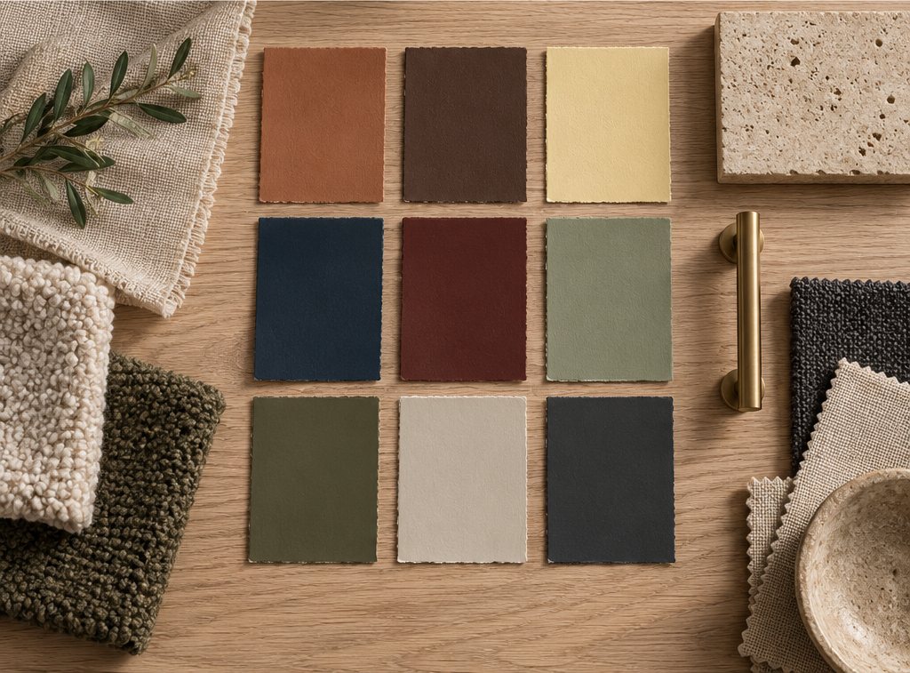
Six of the picks are shown below. The Grounded, Cottage Door and Artifact swatches use the approximate hex values the brands publish; the celery, terracotta and rose-earth swatches are our own approximations of those color families, not official matches, so always check a physical sample.
#C9D3A3#5E5C50#7A8F97#69808B#B5603C#C29A8EIf the earth tones on this list appeal most, our earth tone color palette guide gives five complete schemes with LRV ranges.
How to use them at home
Use the pale 2027 picks on walls and ceilings, the mid tones on whole rooms or doors, and the deep picks on cabinetry, paneling or one drenched room. Here is how we would place them room by room.
Living room
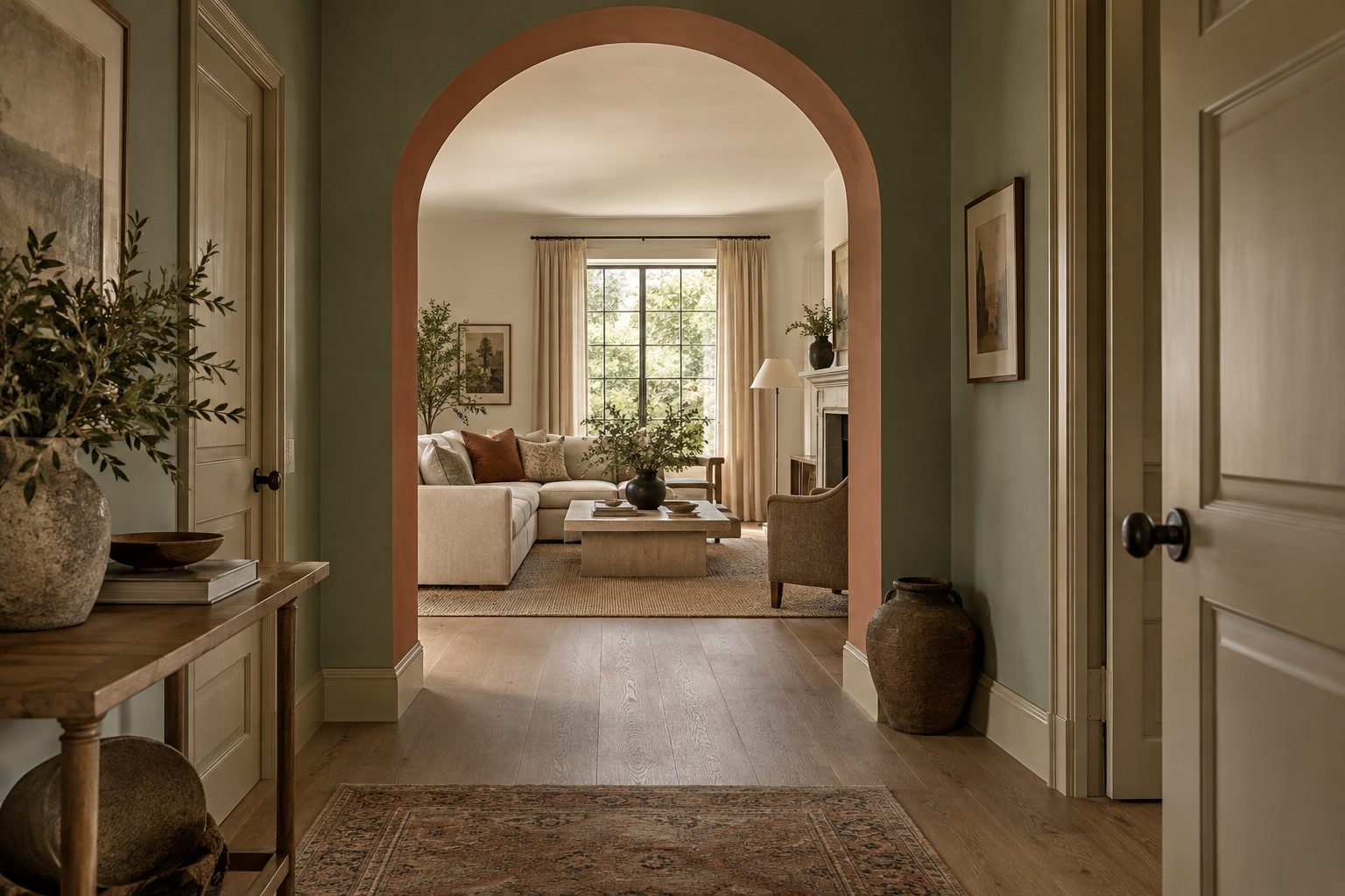
Soulful Sage or Marle on walls, with a warm white ceiling, an oak floor and linen upholstery. Add Rose Earth through a rug or cushions. Keep Grounded for a bookcase wall or the back of built-in shelving.
Kitchen
Celery on walls above wood cabinets, or Grounded on lower cabinets with a warm white upper run and a honed stone counter. Brass or bronze hardware suits both.
Bedroom
Cottage Door or Artifact on all four walls, with warm white bedding and walnut furniture. In a small bedroom, take the color onto the ceiling to blur the corners.
Bathroom
Celery or Soulful Sage, drenched, with terracotta or warm white tile. Use a moisture-resistant satin finish in wet zones.
Dining room and den
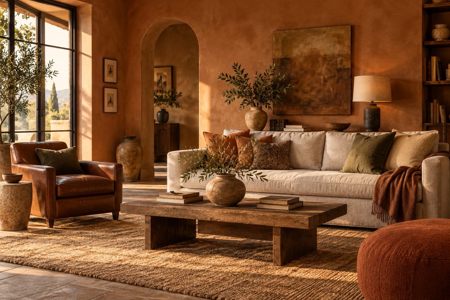
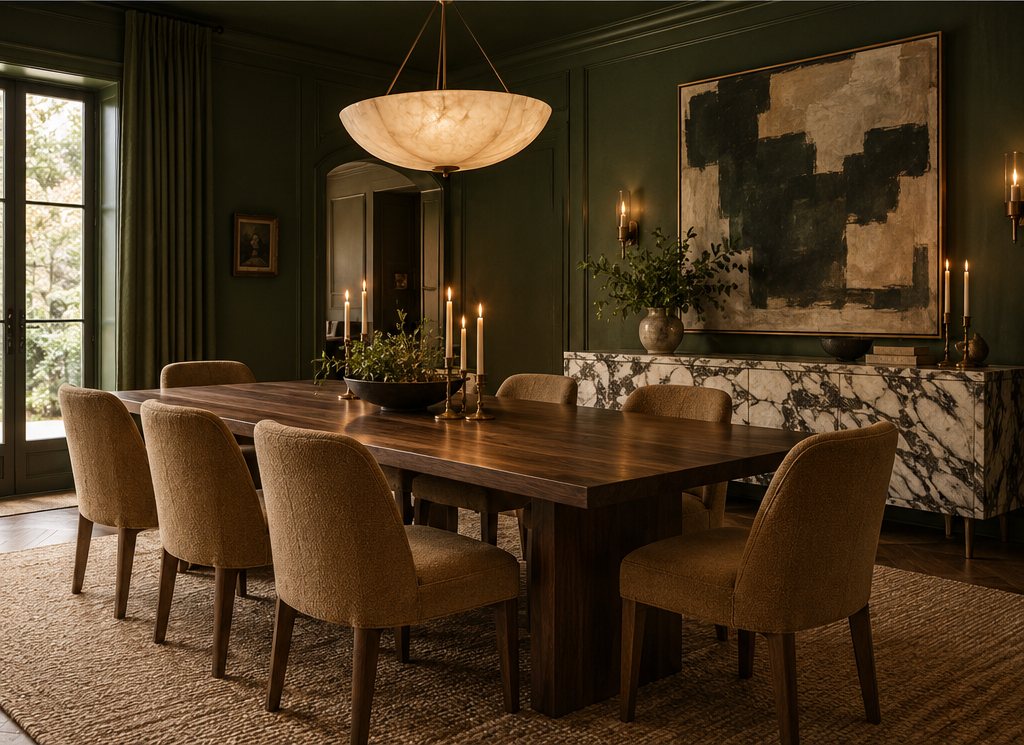
Pueblo, Deep Rooted or Grounded drenched across walls, trim and ceiling, lit with 2700K lamps. These are evening rooms, and the deep warm picks glow at night.
Exterior and front door
Cottage Door or Artifact on a front door, Deep Rooted on a garden wall or planters. Test exteriors in full sun; colors look two shades lighter outside.
What colors go with celery green?
Celery green goes best with warm whites, natural oak, terracotta, soft brown and unlacquered brass; avoid cool blue-whites and chrome, which make its yellow undertone look acidic. Because Celery is the most searched 2027 pick, here are the combinations we would actually specify:
- Celery + warm white + oak: the easiest scheme; works in any kitchen.
- Celery + terracotta: green walls with clay floor tile or terracotta pots, a garden-room look.
- Celery + soft brown: pair with a whisper brown on trim or ceiling for a quiet, tonal room.
- Celery + deep olive: pale walls, olive cabinetry below, for depth without contrast shock.
- Celery + dusty pink: a rose-earth textile or headboard keeps the green from feeling clinical.
How do you decorate with the 2027 colors of the year?
Decorate with the 2027 colors of the year by choosing one pick as the room's main color, building a warm neutral around it and testing large samples in your own light before you commit. This is the sequence we use:
- Pick one lead color per room. Two colors of the year in one room usually compete; use the second as a textile or object.
- Check the light. North light cools colors, south light warms them. Choose warmer picks for north rooms.
- Sample big. Paint sample boards of at least 24 × 24 in (60 × 60 cm) and move them around the room for 48 hours.
- Choose the neutral. A warm white or soft brown for trim and ceiling, never a cool brilliant white.
- Set the sheen. Matte or flat on walls, satin in kitchens and bathrooms, satin or semi-gloss on trim and cabinets.
- Add materials last. Oak, walnut, terracotta, linen and brass all suit this year's palette.
For the full generic trend picture, with hex values and LRV by room, read our paint color trends 2027 guide, and browse coordinated schemes in our palette library.
Our verdict: which 2027 color of the year to choose
If you only change one room, choose Sherwin-Williams Celery for a kitchen or bathroom and Behr Grounded for cabinetry or a study; both are easy to live with well beyond 2027. Cottage Door is the safest choice for a bedroom. Pueblo and Rose Earth are the most distinctive picks and reward commitment, so drench a small room rather than painting one accent wall. The picks we would treat most carefully are the bright Luminous Blue, better in a textile than on a wall, and any color you have not tested in your own light. A color of the year is a useful starting point, not an obligation, and the best room is the one that suits your light and your furniture. Our interior design trends 2027 report shows how these colors fit the wider direction.
Want the 2027 picks turned into ready-to-use schemes? Our palette pack includes coordinated wall, trim and accent combinations built around this year's greens, blues and earth tones, with LRV values and sheen notes for every room.
Free toolTile CalculatorWork out tiles, boxes, grout and adhesive with the right wastage.Shop & source the look
Buy it today — or have it made
Retail links are affiliate links: we may earn a commission at no extra cost to you (disclosure). “Get it made” sends the item to our sourcing desk for factory quotes in custom sizes and finishes.
Frequently asked questions
What is the color of the year for 2027?
There is no single color of the year for 2027. As of 9 October 2026, ten brands and forecasters have announced picks, led by greens: Sherwin-Williams Celery, Behr Grounded and Dulux Soulful Sage. Muted blues, warm browns, terracotta and rose earth complete the list. Benjamin Moore and Pantone have not announced yet.
What is Sherwin-Williams color of the year 2027?
Sherwin-Williams color of the year 2027 is Celery, SW 6421, a crisp light green with warm yellow undertones. It reads fresh and calm, works on all four walls of a kitchen or bathroom, and pairs best with warm whites, oak and unlacquered brass. It follows the brand's 2026 pick, Universal Khaki SW 6150.
What is Pantone's color of the year for 2027?
Pantone has not announced its color of the year for 2027 yet. The institute traditionally reveals its pick in early December, so expect it in December 2026. Its 2026 color was Cloud Dancer, a soft white. We will update this page with the 2027 color as soon as it is published.
How do you decorate with the 2027 colors of the year?
Pick one 2027 color as the lead for each room, then build a warm white or soft brown around it for trim and ceiling. Test 24 × 24 in sample boards in your own light for two days. Use the pale greens and blues on walls and the deep olive, terracotta or rose-brown on cabinetry or one drenched room.
What colors go with celery green?
Celery green goes best with warm whites, natural oak, terracotta, soft brown, deep olive, dusty pink and unlacquered brass. Those warm partners flatter its yellow undertone. Avoid cool blue-white paint, gray-white tile and chrome, which make celery look acidic, and use a warm white rather than a brilliant white on trim.
Some links may be affiliate links. Regulations and specifications change — always confirm with suppliers and qualified professionals.