Color Wheel Interior Design: Schemes, Warm vs Cool and Pairings
Color wheel interior design uses 12 hues and six classic schemes to build room palettes that work: complementary, analogous, triadic and more. Here is how to apply them with muted paint, warm vs cool colors and the 60-30-10 rule.
Part of our guide: How to Choose Modern Color Schemes for Your Whole House Interior
Key takeaways
- The color wheel has 12 hues: 3 primaries, 3 secondaries and 6 tertiaries; every classic scheme is a pattern of positions on it
- In rooms, use wheel schemes with muted, grayed versions of each hue and apply them in 60-30-10 proportions
- Warm colors advance and energize, cool colors recede and calm; balance them by light direction and room use
- Complementary pairs give the strongest contrast; analogous schemes are the easiest to live with
Color wheel interior design means choosing a room's colors by their positions on the 12-hue color wheel: neighbors (analogous) for calm, opposites (complementary) for contrast, three evenly spaced hues (triadic) for energy. Designers then mute each hue and apply it in 60-30-10 proportions, so the scheme feels balanced rather than loud.
The wheel is not a rulebook, but it is the fastest way to explain why some combinations feel right and others clash. It tells you which colors relate; your light, materials and proportions decide whether they work. For finished room-by-room schemes, our interior color schemes guide is the companion pillar; this page explains the theory underneath it.
- 12 hues: 3 primary, 3 secondary, 6 tertiary.
- 6 classic schemes: monochromatic, analogous, complementary, split-complementary, triadic and tetradic.
- Two temperatures: warm (red to yellow-green side) and cool (green to violet side).
- Proportion rule: 60 percent dominant, 30 percent secondary, 10 percent accent.
- Key adjustment: in rooms, use tints, tones and shades of each hue, rarely the pure color.
What colors are in the color wheel?
The traditional painter's color wheel holds 12 colors: the primaries red, yellow and blue; the secondaries orange, green and violet; and six tertiaries made by mixing a primary with its neighboring secondary. This red-yellow-blue (RYB) wheel is the one interior designers and painters use.
| Group | Colors | How they are made | Temperature |
|---|---|---|---|
| Primary | Red, yellow, blue | Cannot be mixed from other paint colors | Red and yellow warm, blue cool |
| Secondary | Orange, green, violet | Two primaries mixed in equal parts | Orange warm, green and violet borderline to cool |
| Tertiary | Red-orange, yellow-orange, yellow-green, blue-green, blue-violet, red-violet | A primary plus its neighboring secondary | Red-orange, yellow-orange warm; blue-green, blue-violet cool; others borderline |
Screens and printers use different wheels, the additive red-green-blue and subtractive cyan-magenta-yellow systems, which is why a color picked on a monitor rarely matches a paint chip. For walls, think in the painter's RYB wheel, then check real samples.
Tints, tones and shades
Every hue on the wheel has three variations that matter more in a room than the pure color. A tint adds white (blush from red), a tone adds gray (sage from green), and a shade adds black (oxblood from red). Most livable interiors are built almost entirely from tones and tints, with shades for depth.
What are the main color wheel schemes for interiors?
The six color wheel schemes used in interiors are monochromatic, analogous, complementary, split-complementary, triadic and tetradic, ranging from the calmest to the most energetic. The table shows how each one translates into a real room.
| Scheme | Wheel positions | Feel | Example room palette | Difficulty |
|---|---|---|---|---|
| Monochromatic | One hue, many tints and shades | Calm, enveloping | Pale sage walls, mid-green sofa, deep green cabinetry | Easy |
| Analogous | 3 neighbors, e.g. yellow, yellow-green, green | Harmonious, natural | Ochre, olive and moss with oak floors | Easy |
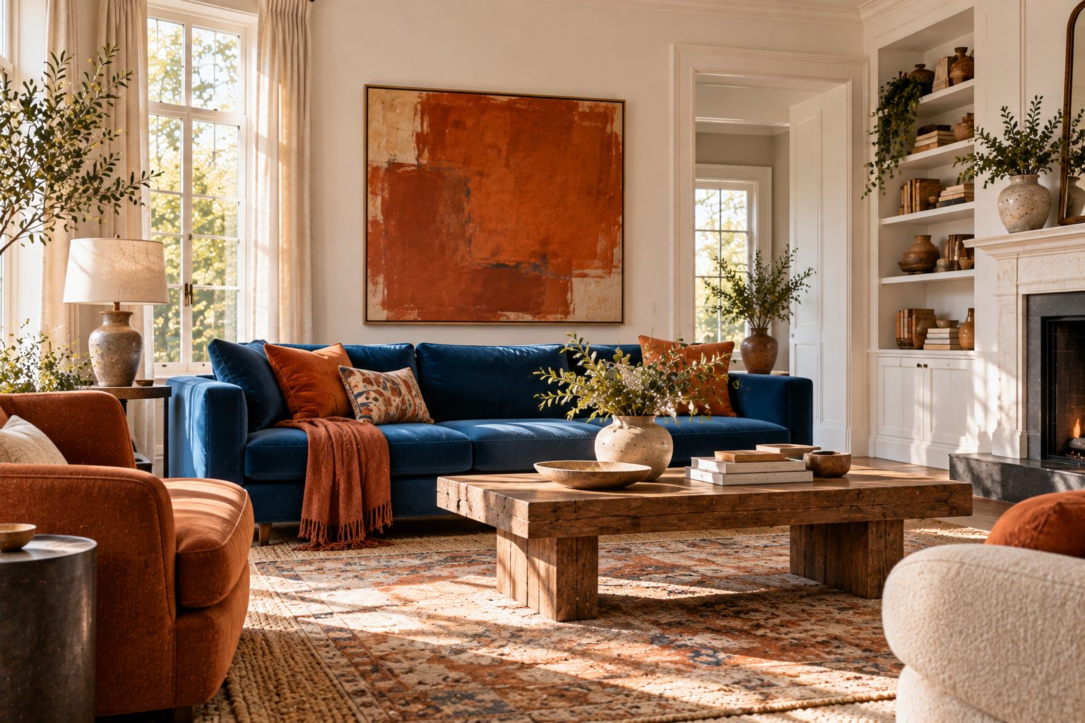
| Complementary | 2 opposites, e.g. blue and orange | High contrast, lively | Navy walls, rust velvet chair, cream trim | Medium |
| Split-complementary | 1 hue plus the 2 beside its opposite | Contrast with less tension | Blue-gray walls with terracotta and mustard accents | Medium |
| Triadic | 3 evenly spaced hues, e.g. red, yellow, blue | Playful, energetic | Muted brick, ochre and slate blue | Hard |
| Tetradic (square or rectangle) | 4 hues in two complementary pairs | Rich, maximal | Plum, olive, rust and teal in a layered library | Hardest |
As a rule of thumb, the more hues a scheme uses, the more it needs one of them to dominate and the others to be muted. Analogous schemes based on earthy hues are the basis of our earth tone color palette, the most requested scheme we work with.
How do you use complementary colors in a room?
Use complementary colors by letting one dominate and the other appear as a small accent, and by muting both so they contrast without vibrating. Complementary colors sit opposite each other on the wheel: red and green, blue and orange, yellow and violet.
A complementary color scheme is the most dramatic of the classic pairings because each color makes the other look more intense. In a room that is a strength in small doses and tiring at full strength. The pairings we use most often:
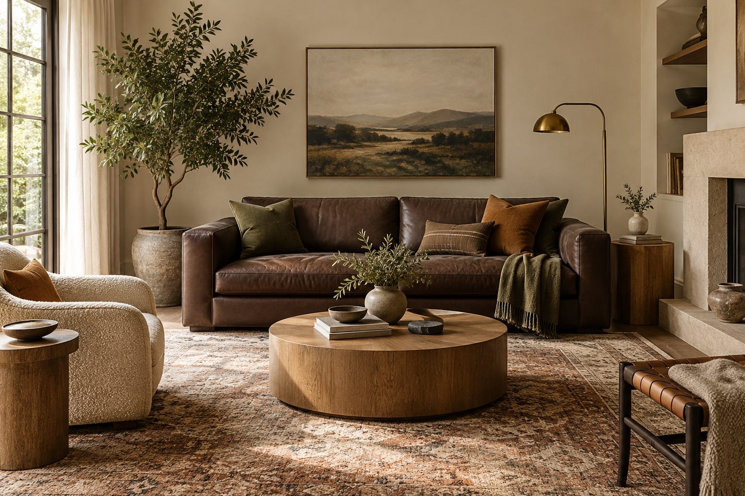
- Blue and orange: slate or navy walls with rust, cognac leather or terracotta. The most forgiving complementary pair indoors.
- Green and red: sage or olive with brick, oxblood or dusty pink. Feels traditional in deep tones, fresh in tints.
- Yellow and violet: ochre or mustard with aubergine or lavender gray. The trickiest; keep the violet very gray.
Hold the dominant color to about 60 percent of the visual field and the complement to 10 percent, with a neutral taking the middle 30. Our blue paint colors and sage green paint colors guides suggest specific complementary accents for each shade.
Warm vs cool colors: what is the difference?
Warm colors are reds, oranges and yellows that feel energizing and appear to advance toward you; cool colors are greens, blues and violets that feel calming and appear to recede. The split runs roughly through yellow-green and red-violet, which can read either way.
#B5523B#D9A441#C98A7A#7E9A6E#3F6E8C#7A5A86The hex values are screen references only; compare real paint chips in your own light. Warm and cool colors behave differently in space, and that matters more than any trend:
| Quality | Warm colors | Cool colors |
|---|---|---|
| Hues | Red, orange, yellow, red-orange, yellow-orange | Green, blue, violet, blue-green, blue-violet |
| Spatial effect | Advance; walls feel closer | Recede; walls feel farther away |
| Mood | Sociable, cozy, energetic | Calm, fresh, restful |
| Best light | North-facing and dim rooms | South- and west-facing rooms |
| Typical rooms | Dining rooms, living rooms, kitchens | Bedrooms, bathrooms, offices |
Warm tones and cool tones inside neutrals
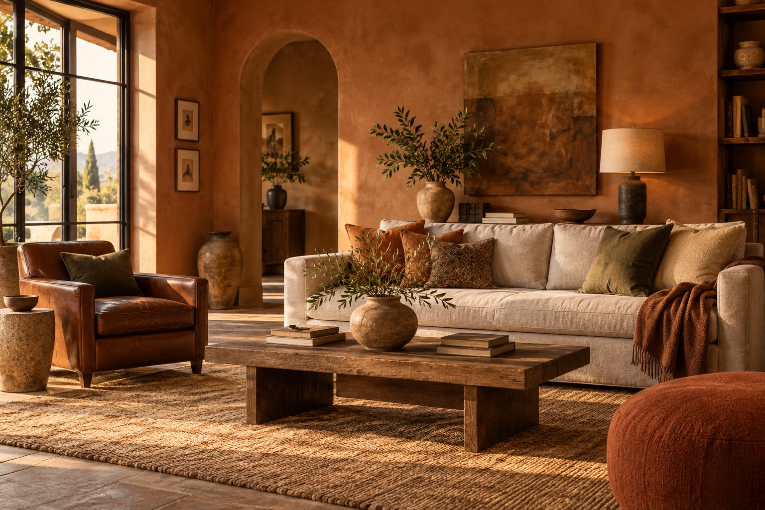
Temperature also lives inside neutrals. A warm-tone white leans yellow or red; a cool colour tone white leans blue or green. Warm tone colors such as cream, camel and terracotta pair with warm wood and brass; cold colors such as icy gray and blue-white pair with chrome, marble and concrete. Mixing warm cool colors is not wrong, but every room needs one temperature in charge. For warm schemes in detail, see our warm living room colors guide.
Warm colors and cool colors also change with light: north light pulls everything cool, so warm tones help; strong west light pushes everything warm, so cool colors steady it. Cool colors vs warm colors is therefore never just taste; it is a response to the room.
What is a good 3 colour combination for a room?
A good 3 colour combination for a room is one neutral, one main color and one accent, chosen as either analogous neighbors or a triadic set, then applied 60-30-10. Three colors give enough interest without needing a designer to hold them together.
Combinations we have used and would repeat:
- Analogous calm: warm white, sage green and olive, with oak and linen.
- Muted triadic: slate blue, ochre and brick, all grayed down, over a cream base.
- Split-complementary: blue-gray walls, terracotta cushions and a touch of mustard in a print.
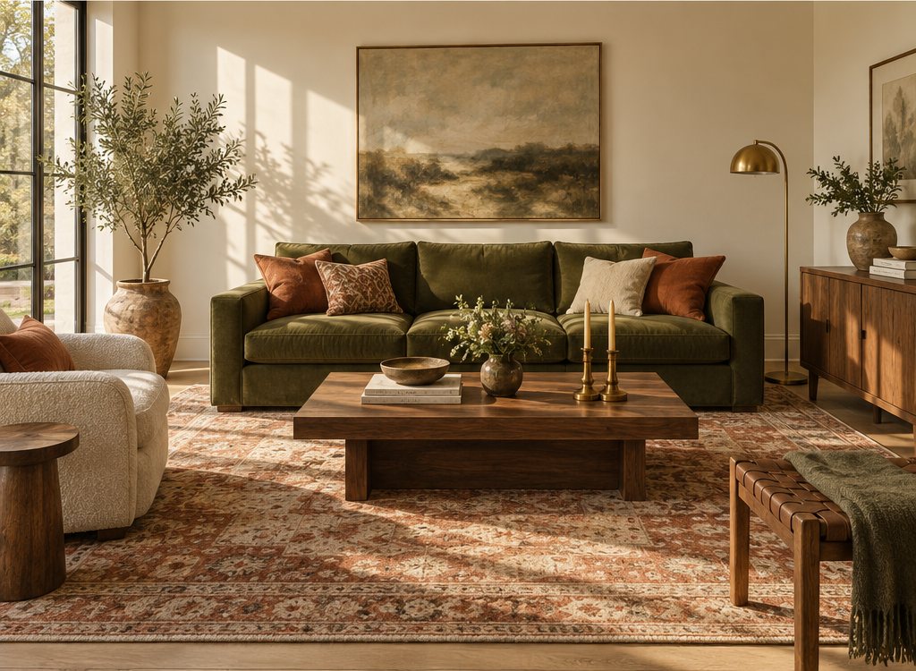
- Warm monochrome plus one: cream, camel and a single deep green velvet chair.
When people ask what colors go good together, these are the safest answers because each pair is related on the wheel and each color is softened with gray or white.
What colors go with pink?
The colors that go with pink are green (its complement), warm neutrals such as cream and camel, terracotta and rust (its warm neighbors), navy and deep blue for contrast, and charcoal for a modern edge. Dusty and plaster pinks are the easiest to live with.
Pink is a tint of red, so the wheel predicts its partners. Colors that match with pink by scheme:
- Complementary: sage, olive and forest green. Plaster pink with sage is the most reliable colour scheme with pink we know.
- Analogous: terracotta, coral, peach and soft red-violet for a warm, enveloping room.
- Contrast: navy, ink blue and charcoal walls with pink upholstery or cushions.
- Neutral base: warm white, oatmeal and light oak let pink carry the room on its own.
Good color schemes with dark pink
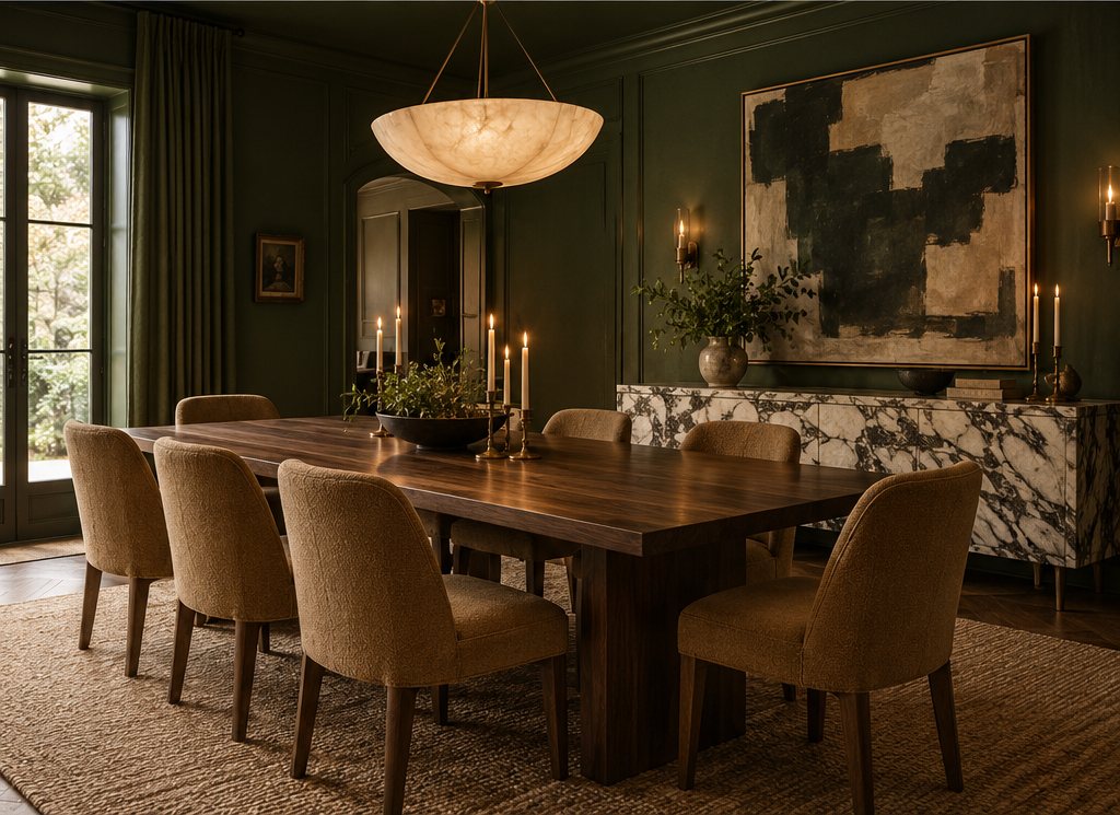
Good color schemes with dark pink, such as raspberry, fuchsia or deep rose, need equally confident partners: bottle green, deep teal, oxblood, chocolate brown or navy. Keep the dark pink to 10–30 percent of the room, typically a sofa, curtains or a lacquered door, and ground it with a warm white and plenty of wood. Brighter pinks belong in playful, maximal schemes, where they share the room with other saturated accents.
Color mixing chart: what colors make other colors?
In paint, red plus yellow makes orange, yellow plus blue makes green and blue plus red makes violet; adding a color's complement grays it down, and adding white, gray or black creates tints, tones and shades. That is the whole color mixing chart in one sentence.
| Mix | Result | Use in interiors |
|---|---|---|
| Red + yellow | Orange | Terracotta, rust and peach once grayed |
| Yellow + blue | Green | Sage, olive and moss once grayed |
| Blue + red | Violet | Plum, aubergine and lavender gray |
| Any color + its complement | A muted, grayer version, toward brown or gray | Turns bright hues into livable tones |
| Any color + white | Tint | Blush, powder blue, pale sage |
| Any color + black | Shade | Oxblood, navy, forest green |
You do not need to mix your own wall paint, but trying it once on an artist paint palette with a few tubes of acrylic is the quickest way to understand why a green with a touch of red reads as sophisticated olive rather than kelly green. That muting principle is what separates a designer room from a child's playroom.
How do you build a room palette from the color wheel?
Build a room palette by fixing the dominant color from your largest fixed finish, choosing a scheme on the wheel, muting every hue, then assigning 60-30-10 proportions to walls, furnishings and accents. Here is the order we follow.
- Start with the biggest fixed thing. The floor, a large rug or a sofa you are keeping sets the first hue and temperature.
- Pick a scheme. Analogous for calm rooms, complementary or split-complementary for living and dining rooms with some energy.
- Mute every hue. Choose tones and tints from the paint deck rather than pure colors; look for chips one or two rows grayer.
- Assign 60-30-10. 60 percent walls and large rug, 30 percent upholstery and curtains, 10 percent cushions, art and accessories.
- Add a neutral and a dark. A warm white or cream for trim and ceiling, and one deep anchor such as charcoal or brown for depth.
- Check LRV contrast. Keep at least 20–30 points of LRV between walls and the main furniture so the room does not flatten.
- Sample everything together. Paint boards, fabric swatches and wood samples on one table, in the room's light.
When you move to paint, our how to choose a paint color guide covers samples, undertones and light direction step by step.
Mistakes we see with color wheel schemes
The mistake we see most is using wheel colors at full saturation; pure complementary red and green look festive, while muted brick and sage look elegant. Theory picks the relationships; restraint makes them livable.
- Equal amounts of every color. Three colors at 33 percent each fight. One must lead.
- Ignoring wood and stone. Oak, walnut and travertine are colors too, almost always warm orange or yellow on the wheel.
- Mixing undertones within one hue. A blue-leaning green beside a yellow-leaning green looks like a mistake, not a scheme.
- Forgetting light. A cool scheme in a north room can feel cold; shift it warmer or add warm lamps at 2700 K.
Our verdict: for most homes, an analogous scheme with one complementary accent is the sweet spot. It is calm enough for daily life and has one spark of contrast. Explore tested combinations on our palettes page.
Prefer not to build it from scratch? Our palette pack gives ready-made color wheel schemes with paint-matched swatches, LRVs and 60-30-10 room splits you can use straight away.
Free toolCurtain Size CalculatorRod length, panel size, ready-made match and yardage.Shop & source the look
Buy it today — or have it made
Retail links are affiliate links: we may earn a commission at no extra cost to you (disclosure). “Get it made” sends the item to our sourcing desk for factory quotes in custom sizes and finishes.
Frequently asked questions
What colors are in the color wheel?
The traditional color wheel has 12 colors: three primaries (red, yellow, blue), three secondaries (orange, green, violet) and six tertiaries (red-orange, yellow-orange, yellow-green, blue-green, blue-violet and red-violet). Interior designers and painters use this red-yellow-blue wheel to plan schemes, while screens use a different red-green-blue system.
What colors are warm colors?
Warm colors are reds, oranges and yellows, plus the tertiaries between them such as red-orange and yellow-orange. They feel energetic and cozy and make walls appear closer. In interiors, warm colors include terracotta, ochre, camel, coral and warm whites, and they work especially well in north-facing or dimly lit rooms.
What colors are cool colors?
Cool colors are greens, blues and violets, plus blue-green and blue-violet. They feel calm and fresh and make walls appear to recede, which helps small rooms feel larger. Common cool interior colors include sage, slate blue, navy, teal and lavender gray; they suit bedrooms, bathrooms and sunny south- or west-facing rooms.
What colors blend with pink?
Pink blends best with sage and olive green, warm neutrals such as cream and camel, terracotta and coral, navy, and charcoal. Green is pink's complement, so it gives balanced contrast, while terracotta and peach are its warm neighbors for a softer analogous look. Muted, dusty pinks combine more easily than bright ones.
What colors go good together in a room?
Colors that go well together are usually related on the color wheel: neighboring hues such as sage, olive and ochre, or muted opposites such as navy and rust. Pair them with one warm or cool neutral, apply them in 60-30-10 proportions and choose grayed tones rather than pure colors for a calm, livable result.
Some links may be affiliate links. Regulations and specifications change — always confirm with suppliers and qualified professionals.