Blue Paint Colors: Navy, Dark Blue, Blue Green and Light Blues
The best blue paint colors split into five families: navy, dark blue, blue green, gray-blue and light blue. Here are LRV ranges, 12 hex references, undertones and the colors that go with blue in every room.
Part of our guide: Interior House Paint Ideas: Color Schemes & Room Paint Design
Key takeaways
- Blue paint colors fall into five families: navy, dark blue, blue green, gray-blue and light blue, each with a different undertone and LRV
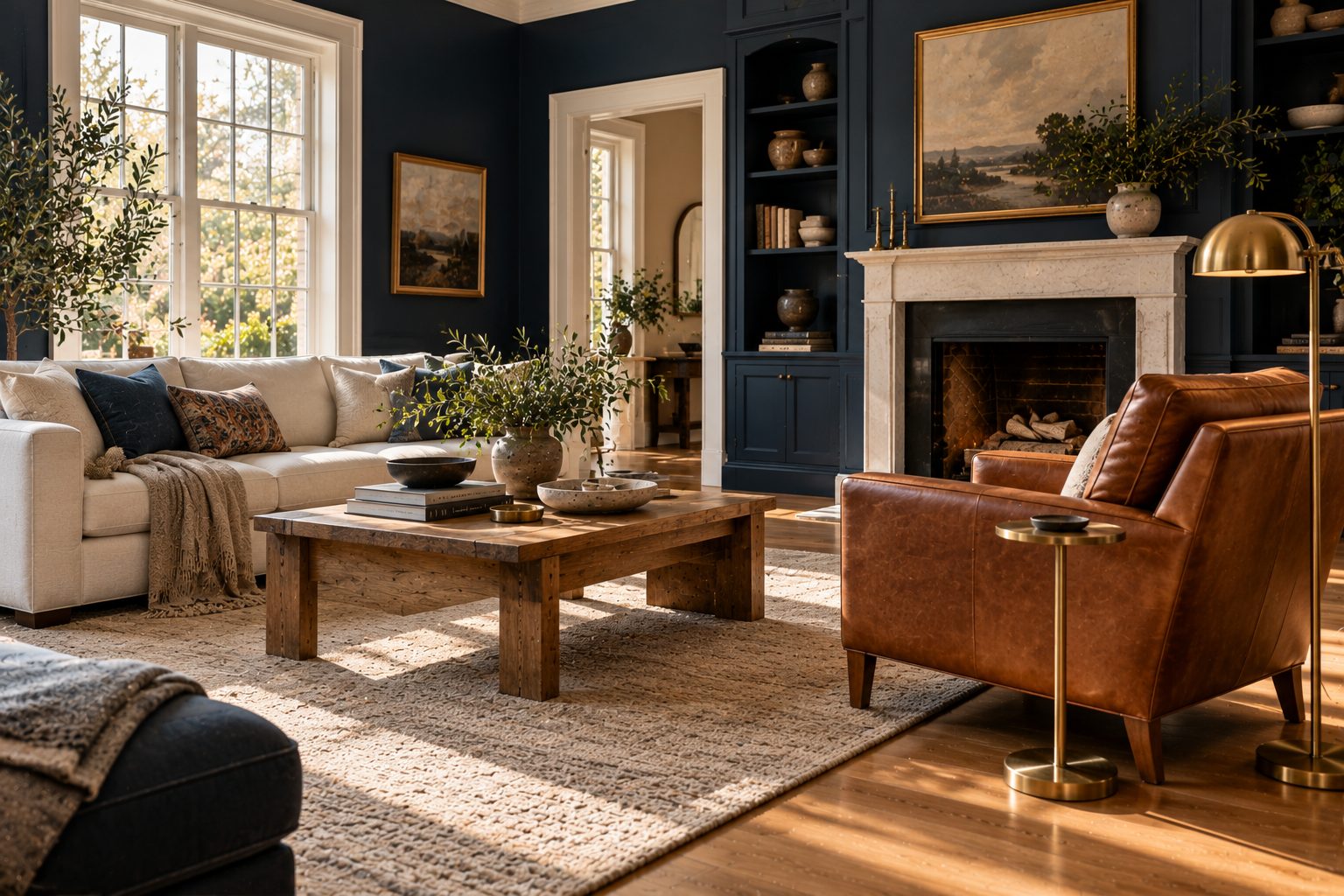
- Navy blue paint with an LRV of about 4–10 reads near-black at night; pick one with a slight warm or green undertone so it does not look purple
- Light blues turn cold in north-facing rooms; choose a gray-blue or a blue with a hint of green there
- Blue pairs best with warm wood, brass, terracotta, cream and soft white, the colors on the opposite side of the color wheel
The best blue paint colors for 2027 are deep navy with a slightly warm undertone, ink and midnight dark blues, muted blue greens such as teal and slate, soft gray-blues and pale chalky light blues. Pick by light: navy and blue green suit south-facing rooms and cabinets, gray-blue suits north light, and light blues need warm 2700 K bulbs to avoid looking cold.
Blue is the most popular accent color in American homes and the hardest to get right on a wall, because its undertone shifts more with light than almost any other hue. This guide sorts blue paint by family, explains shades, tints and tones, and gives you a blue color palette that works. For finishes, prep and room-by-room ideas beyond blue, see our main guide to interior painting ideas.
- Five families: navy, dark blue, blue green, gray-blue and light blue.
- LRV range: navy 3–10, dark blue 5–15, blue green 8–30, gray-blue 30–55, light blue 55–75.
- Undertones: blues lean green (warmer, calmer), gray (muted) or violet (cooler, more vivid).
- Best pairings: warm wood, brass, terracotta, cream, rust and soft warm white.
What are the best blue paint colors?
The best blue paint colors are slightly muted rather than pure: a little gray, green or black in a blue keeps it calm on a large wall, while saturated primary blue only works in small doses.
The table sorts blue paint colors into the five families designers actually use. LRV (light reflectance value) runs from 0 for black to 100 for pure white; the ranges are typical for each family across paint makers, and the hex codes are approximate screen references, not paint matches.
| Blue family | Typical LRV | Undertone | Approx. hex reference | Best uses |
|---|---|---|---|---|
| Navy | 3–10 | Black, slight green or violet | #1F2A44 | Accent walls, cabinets, doors, dining rooms |
| Dark blue (ink, midnight, indigo) | 5–15 | Black or violet | #22324F | Studies, color-drenched rooms, ceilings |
| Blue green (teal, peacock, slate teal) | 8–30 | Green | #4F7C82 | Kitchens, bathrooms, bedrooms, built-ins |
| Gray-blue (slate, denim, stormy) | 30–55 | Gray | #7E95A6 | Bedrooms, living rooms, north-facing rooms |
| Light blue (sky, powder, duck egg) | 55–75 | Gray, green or violet | #B9CBD6 | Bedrooms, bathrooms, porch ceilings, nurseries |
As a rule of thumb, the lower the LRV, the more the room's light will flatten the undertone into a near-black, and the higher the LRV, the more any violet or green undertone will show.
What are the different shades of blue?
The different shades of blue range from pale powder and sky blue through cornflower, cerulean, cobalt and royal blue to navy, indigo and midnight, plus the greenish blues such as teal, turquoise and aqua.
Shades and tones of blue explained
Color theory uses three words precisely. A tint is blue plus white (powder, sky), a shade is blue plus black (navy, midnight), and a tone is blue plus gray (slate, denim). Most good wall blues are tones, which is why they look sophisticated rather than childlike. When people search for shades of blue color, they usually mean all three, and paint charts mix them together.
How many blue colors are there?
There is no fixed number of blues. The human eye can distinguish thousands of blue variations, and a large paint fan deck typically holds 150–300 blues. In practice, the names fall into a dozen or so groups you can use when talking to a paint counter or a designer:
- Light tints: powder blue, baby blue, sky blue, ice blue, duck egg.
- Mid blues: cornflower, periwinkle, cerulean, denim, French blue.
- Vivid blues: cobalt, royal blue, sapphire, ultramarine, electric blue.
- Dark shades: navy, midnight, indigo, ink, Prussian blue, oxford blue.
- Greenish blues: teal, turquoise, aqua, peacock, petrol.
Navy blue paint: how to choose the right navy
The right navy blue paint has an LRV of about 4–10 and a faint warm or green undertone; navies with a violet undertone tend to look purple under warm bulbs.
Navy blue is the most searched blue by far, and for good reason: it behaves almost like a neutral. A navy color works with oak, walnut, brass, white marble and nearly every textile, and it reads traditional or modern depending on the trim. The navy blue color most designers reach for sits around #1F2A44 on screen: dark enough to feel rich, with enough blue left to read as blue in daylight.
Dark navy blue, closer to #141C2E, is the near-black version. It is beautiful on a front door, a kitchen island or a library, but in a room with one small window it can read as black most of the day. Test it at night as well as at noon. For cabinets, use satin or semi-gloss; for walls, matte or eggshell. Our paint sheen guide explains where each finish belongs.
Navy vs black
Navy is often chosen as a softer alternative to black, and it earns that role: on cabinets and doors it gives the same weight and contrast, but it reads warmer in daylight and shows dust and fingerprints less. Black is crisper and more graphic; navy is more forgiving with wood and brass. If you are torn, paint one door in each and look at them at dusk.
- Best rooms: dining rooms, studies, bedrooms with good daylight, powder rooms.
- Best trim: a warm white at LRV 80–85, or the same navy for a color-drenched look.
- Best metals: unlacquered or aged brass, bronze, polished nickel.
What are the best shades of dark blue for walls?
The best shades of dark blue for walls are ink, midnight and indigo, which sit between navy and black, plus deep slate blue, which carries a gray undertone and feels softer on large areas.
Dark blue colors make walls recede, so they can make a small room feel deeper rather than smaller, provided the room has enough light at night. Use them on all four walls and the ceiling for a cocooning study or bedroom; our color drenching guide explains how to vary sheen across walls, trim and ceiling in the same color.
When people look up names of shades of dark blue, these are the ones paint makers use most often, described generically:
- Midnight: blue-black with almost no visible undertone, LRV 3–5.
- Ink: a slightly violet dark blue, LRV 4–7, rich under warm light.
- Indigo: violet-leaning and textile-like, LRV 5–9.
- Prussian blue: a deep blue with a green cast, LRV 5–10.
- Deep slate: gray-blue at LRV 10–15, the easiest dark blue to live with.
Blue green color: teal, slate and greenish blue paints
A blue green color is any hue between blue and green on the color wheel; bluish green leans green and reads warmer, while greenish blue leans blue and reads cooler and crisper.
Blue greens are the strongest 2027 direction within the blue family because they bridge the green trend and classic blue. Muted teal, petrol and slate teal suit kitchens and bathrooms especially, since they flatter wood, brass and white tile. A green blue at LRV 10–20 makes a confident cabinet color; at LRV 30–45 it is gentle enough for a bedroom. If you prefer the green side, our sibling guide to sage green paint colors covers the softer, grayer greens.
Teal vs turquoise
Teal is a dark, muted blue green with gray or black in it, usually at LRV 8–20, which makes it a strong cabinet and accent wall color. Turquoise is lighter and much more saturated, closer to tropical water, at LRV 35–55. Teal reads grown-up and works year-round; turquoise reads playful and beachy and is best on small surfaces.
The trap with blue greens is saturation. Turquoise and bright aqua look cheerful on a chip and loud on four walls. Choose a version with visible gray in it, check it next to your countertop and floor, and keep the vivid aquas to a door or a piece of furniture.
How do light blue paint colors behave in different light?
Light blue paint colors look warmest in south-facing rooms and coldest in north-facing rooms, so pick a gray-blue or green-leaning light blue for north light and save the clean sky blues for sunny rooms.
| Room orientation (Northern Hemisphere) | How blue reads | Choose | Bulb color |
|---|---|---|---|
| North-facing | Grayer, colder, flatter | Green-leaning or gray-blue, LRV 40–60 | 2700 K |
| South-facing | Brighter, warmer, can wash out | Clean blues, navy, deeper blue greens | 2700–3000 K |
| East-facing | Bright and warm mornings, cool afternoons | Gray-blue or soft blue green | 2700 K |
| West-facing | Cool mornings, warm golden evenings | Most blues; avoid very violet ones | 2700–3000 K |
Light blues also have a traditional outdoor use: pale sky blue painted on porch ceilings, an old Southern custom that brightens a shaded porch and gives the impression of open sky. For that job choose a soft blue at LRV 60–75 with a slight green undertone, in an exterior satin.
Artificial light matters as much as daylight. Under 4000 K and higher bulbs, every blue looks harsher. Keep living spaces at 2700–3000 K with a CRI of 90 or more so the true color shows.
What colors go well with blue?
The colors that go well with blue are warm whites, cream, camel, rust, terracotta and ochre, plus natural wood and brass, because warm tones balance blue's coolness; for a calmer scheme, pair blue with soft gray and other blues.
This is the question behind most searches for a blue color palette, and the answer is to think in temperature. Blue sits opposite orange on the color wheel, so anything in the orange family, from pale peach to deep rust, makes blue look richer. Our color wheel guide explains the complementary and analogous schemes behind these pairings.
#1F2A44#4F7C82#B9CBD6#EFE7DA#B5653F#C79A5BThe hex values are screen references; always confirm with a physical sample. Three palettes we use repeatedly:
- Classic: navy walls, warm white trim, walnut, brass and a rust or camel textile.
- Coastal calm: powder or gray-blue walls, cream linen, pale oak, woven jute and touches of sand.
- Moody: ink blue drenched walls, oxblood or terracotta accents, aged brass and dark wood.
Blue paint by room
Blue paint works in every room, but the right blue changes with the job: deep blues for dining rooms and cabinets, blue greens for kitchens and baths, and soft gray-blues for bedrooms.
- Kitchen: navy or blue green on lower cabinets or the island, with lighter walls. See our kitchen cabinet colors 2027 guide.
- Bedroom: gray-blue or dusty blue at LRV 35–55; dark blue only with good blackout curtains and warm lamps.
- Bathroom: blue green or powder blue with white tile; use a moisture-resistant satin.
- Living room: a mid-tone denim or slate blue on walls, or navy on one wall behind shelving.
- Home office: a deep slate or denim blue behind the desk reads calm on video calls and does not reflect glare onto screens.
- Exterior and front door: navy and dark blue are reliable door colors on white, gray or brick houses.
How to choose blue paint without regret
Choose blue paint by testing large samples on two walls, viewing them at three times of day and comparing them against your fixed finishes before you buy a single gallon.
- Note the room's orientation and bulbs. North light and cool bulbs push blues gray; plan for it.
- Pick a family, then three candidates. One slightly greener, one grayer, one cleaner.
- Paint sample boards at least 12 × 12 in (30 × 30 cm). Two coats, with a white border so the old wall color does not distort them.
- Place them on the darkest and brightest walls. Check morning, late afternoon and at night under lamps.
- Hold them against fixed elements. Floors, counters, tile and sofa fabric decide which undertone wins.
- Calculate quantities. Dark blues often need a gray-tinted primer and two topcoats; our paint calculator works out the gallons.
Our verdict on blue paint colors
If we were choosing one blue for a home in 2027, it would be a softened navy with a faint green undertone, used on cabinets, a dining room or a front door, with warm white walls elsewhere. It is the most forgiving dark color we know, and it looks right with wood and brass for decades. Our second pick is a muted slate teal for kitchens and bathrooms. The blues we would skip are the bright sky blues on whole rooms and the violet-leaning navies, which turn purple at night. The mistake we see most is choosing blue paint from a tiny chip under shop lighting; every blue we have specified looked different on the wall than on the card, so test big and live with it for two days.
Want ready-made schemes around navy, blue green and powder blue, with trim, wood and textile pairings already worked out? Our 2027 palette pack includes tested blue palettes with hex references and LRV notes for every room.
Free toolTile CalculatorWork out tiles, boxes, grout and adhesive with the right wastage.Shop & source the look
Buy it today — or have it made
Retail links are affiliate links: we may earn a commission at no extra cost to you (disclosure). “Get it made” sends the item to our sourcing desk for factory quotes in custom sizes and finishes.
Frequently asked questions
What colors go well with blue?
Warm whites, cream, camel, rust, terracotta and ochre go best with blue, along with natural wood and brass, because warm colors balance blue's coolness. For a calmer, tonal look, pair blue with soft gray, sand and lighter or darker blues. Navy also works with blush and oxblood, and blue green pairs well with walnut and aged brass.
What is the most popular navy blue paint color?
The most popular navy blue paint colors sit at an LRV of about 4–10 with a slightly warm or green undertone, so they read as rich blue in daylight and near-black at night. Avoid navies with a strong violet undertone under warm bulbs. Test samples on a large board, and use satin for cabinets and matte for walls.
What blue paint color is the most calming?
Soft gray-blues and muted blue greens at an LRV of about 35–55 are the most calming blue paint colors, because the gray softens saturation and the green adds warmth. They suit bedrooms and bathrooms especially. Pair them with warm white trim, natural linen and 2700 K lighting so the color does not feel cold.
Does blue paint make a room look bigger?
Light blue paint at an LRV of 55 or higher can make a room look bigger, because it reflects light and reads as receding. Dark blue can also make walls seem to fall away when used on every wall and the ceiling, but the room needs good lamps at night. Mid-tone blues on one wall do the least.
How many blue colors are there?
There is no fixed number of blue colors: the eye can tell thousands apart, and a large paint fan deck usually holds 150–300 blues. Designers group them into tints such as powder and sky, mid blues such as cornflower and denim, vivid blues such as cobalt, dark shades such as navy and indigo, and greenish blues such as teal.
Some links may be affiliate links. Regulations and specifications change — always confirm with suppliers and qualified professionals.