How to Mix Metals in Interior Design: Brass, Black, Nickel and Bronze
The two-to-three finish rule, warm versus cool metals, and how to pair taps, handles, lighting and furniture legs room by room, with durability notes on PVD, lacquer and living finishes.
Key takeaways
- Use two metals per room, three at most, in roughly 60/30/10 proportion
- Pair warm with cool or neutral: brass with black or nickel is the reliable core
- Match all plumbing in one range and finish; let lighting and mirrors carry the second metal
- Specify PVD for wet rooms and touch points; use living finishes only where patina is wanted
Matching every metal in a room to a single finish was never a rule designers followed; it was a shortcut retailers sold. Rooms that look layered and considered almost always run two or three metals against each other: a warm brass tap beside a blackened steel pendant, nickel hardware on a bronze-framed mirror. The trick is doing it with intention. This guide sets out the finishes that matter for 2027, the proportions that work, and how to specify plumbing, lighting and hardware so the mix looks planned rather than accidental.
The metal finishes that matter in 2027
Metal finishes move more slowly than paint colors, but they do move. Polished chrome dominated the 2000s, brushed nickel the 2010s, and satin brass carried the early 2020s. Going into 2027 the field is broader and warmer, and the shift is toward finishes that show their material honestly.
- Brushed (satin) brass: the workhorse warm metal. Softly directional grain, no mirror reflection, hides fingerprints. Usually lacquered or PVD-coated so it stays the color you bought.
- Unlacquered brass: raw brass left to darken and mottle with handling. Bright gold on day one, honeyed and uneven within a year. Loved by designers, misunderstood by clients who expect it to stay shiny.
- Bronze and oil-rubbed bronze: deep brown-black with warm undertones showing at the edges. Reads as old, grounded and slightly rustic; excellent with walnut, leather and terracotta.
- Matte black: powder-coated or PVD black over steel or brass. Graphic and modern; the most-specified accent metal of the decade and still the easiest way to sharpen a soft palette.
- Brushed and polished nickel: the cool metal with a faint warm cast, which is exactly why it plays so well with brass. Brushed nickel is quiet and practical; polished nickel is the classic choice for a traditional bathroom.
- Chrome: the coolest, bluest and brightest finish. Cheap to produce and very durable, hence its ubiquity in rental bathrooms. Used deliberately in small doses it reads crisp and slightly retro.
- Copper: pink-orange and warm, best in brushed or antiqued form on a few pieces. Living copper patinates faster than brass and will streak near water.
- Stainless steel: not a decorative finish so much as a fact of kitchen life. Treat it as a neutral cool metal and mix accordingly.
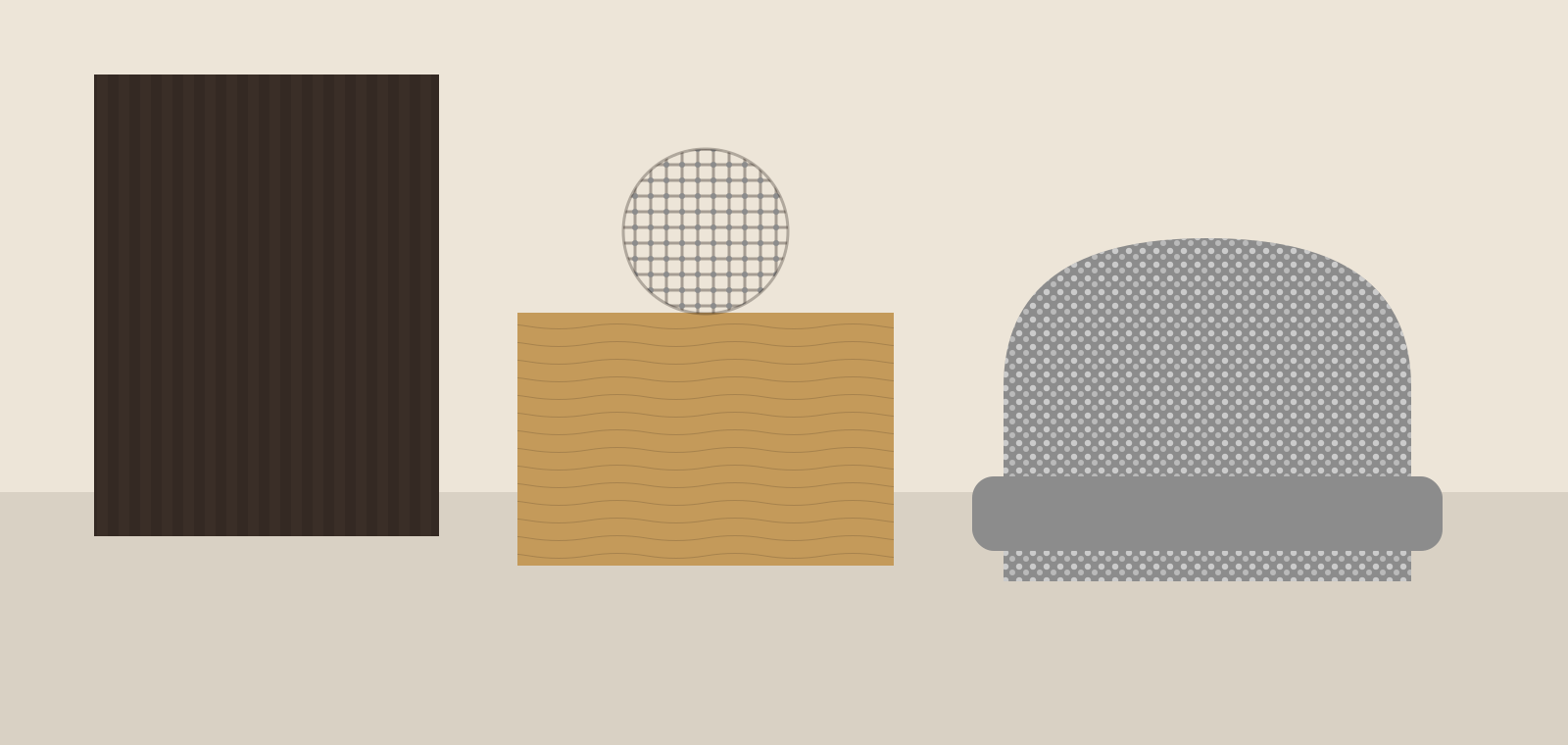
The undertones below are what you are actually pairing when you mix metals; the finish name is secondary.
#C49A5A#D9B26A#3A2E27#1E1E1E#8C8C8C#B87550The two-to-three finish rule
Limit a single room to two metals, three at most. One is dominant, appearing on the largest or most repeated elements; the second is a supporting accent; a third, if used, appears only once or twice as a punctuation mark. Fewer than two feels flat and catalog-like; more than three reads as indecision.
Distribution matters more than count. A useful proportion is roughly 60 percent dominant, 30 percent secondary and 10 percent accent, measured by visual weight rather than piece count. In a kitchen, the dominant metal is usually the one on the handles because there are 20 of them; the tap and the pendants share the secondary role; a single black-framed stool or a copper pot is the accent. Repeat each metal at least twice in the room so it looks like a choice. One lonely brass handle on a wall of black looks like a spare part.
Warm versus cool: the pairing logic
Metals divide into warm (brass, gold, bronze, copper) and cool (chrome, nickel, stainless steel, silver), with black and pewter sitting outside the temperature scale as neutrals. Mixing across temperature is what creates contrast; mixing within one temperature creates a tonal, quieter effect.
- Warm plus neutral: brushed brass with matte black is the most reliable pairing in the book. It works on nearly any palette and is why it has been over-used; keep the brass proportion high and the black to lines and frames to avoid the showroom look.
- Warm plus cool: brass with brushed nickel is the sophisticated version, because nickel's slight warmth bridges the gap. Brass with chrome is harder; chrome's blue cast fights gold unless the room is otherwise very white.
- Warm plus warm: unlacquered brass with oil-rubbed bronze gives a layered, antique reading that suits period houses, libraries and anything Mediterranean or rustic.
- Cool plus neutral: polished nickel with black works in crisp, traditional bathrooms; stainless with black is the default modern kitchen.
Whatever the pairing, keep the finishes different in sheen as well as color. Two brushed metals side by side in similar tones look like a matching error; brushed brass next to polished nickel looks like a decision.
Room by room
Kitchen
Kitchens carry the most metal in the house: handles, tap, lighting, appliances, pot rail, stools. Decide the appliance finish first since it is the least negotiable. With stainless appliances, use brass or bronze for handles and tap and let stainless be the cool counterweight. With integrated appliances, you have a clean slate: brushed brass handles and tap, black pendants over the island and a nickel or stainless pot rail is a balanced three-metal scheme. For a two-metal kitchen, run brass on everything you touch (handles, tap, pot filler) and black on everything you look at (pendants, stool frames, shelf brackets). Cabinet handle sizing and spacing is covered in our kitchen trends report.
Bathroom
Plumbing fittings should match each other: basin mixer, shower valve, shower head, bath filler and any exposed pipework in one finish and, ideally, one manufacturer's range so the geometry matches too. Then bring in the second metal through the mirror frame, lighting, towel rail and cabinet hardware. Polished nickel fittings with an antique brass mirror is a classic; brushed brass fittings with black-framed shower screen and black pendants is the 2027 default. Avoid making the toilet flush plate an orphan: specify it in the plumbing finish.
Living room
Here metal shows up as lamp bases, side table frames, curtain hardware, picture frames, fireplace tools and cabinet hardware. Choose the dominant metal from the lighting since lamps are the most visible, and repeat it on the curtain rod. Then let furniture legs and frames carry the second metal. Blackened steel frames with brass lamps, or bronze lamps with nickel table frames, are both stable combinations. A single piece in a third metal, such as a copper bowl or an antique silver tray, is usually all the accent the room needs. Our living room trends report covers where these pieces sit in a conversation-first layout.
Bedroom
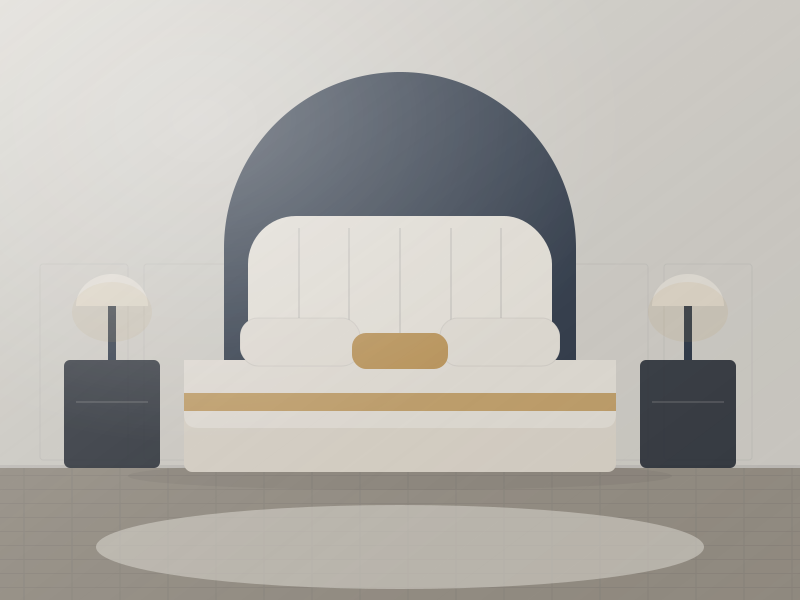
Bedrooms need less metal: bedside lamps, wardrobe handles, a mirror, perhaps a bed frame. Keep to two, and let the lamps and mirror share the dominant finish. Warm metals are kinder under evening lamplight.
Matching plumbing to lighting
The most common question we get is whether the tap should match the pendant. It does not need to, but they should belong to the same scheme. Three approaches work:
- Same finish, different family: brass tap and brass pendants from different makers. Accept that "brushed brass" varies from a pale champagne to a deep gold between manufacturers; request physical samples of both and compare them under the room's actual lighting before ordering.
- Contrasting finish, shared tone: brass tap, black pendants with a brass interior or brass ceiling rose. The shared detail ties the two together.
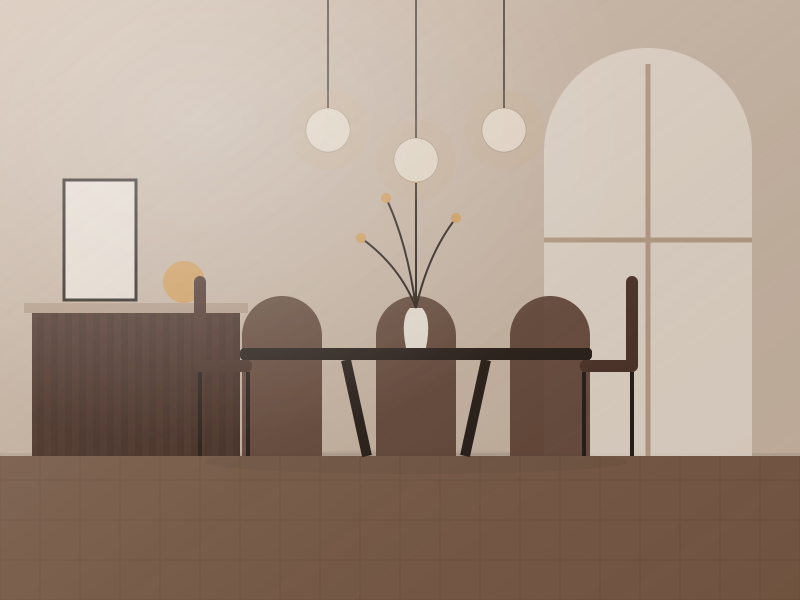
- Cool fittings, warm lighting: nickel or stainless plumbing with brass or bronze lighting. Works well where the sink area is cool stone and the dining area beyond it is warm timber.
Lighting finishes are less regulated than plumbing finishes and are often painted or plated to a lower standard, so expect a black pendant to be a slightly different black from a black tap. The difference reads as texture, not error, provided the shapes are related. For how the light itself interacts with metal surfaces, see how to layer lighting.
Finish durability: PVD, living finish and lacquer
How a finish is applied decides how it looks in five years, and it is the detail most often missing from a product page.
| Finish process | How it is made | Durability | Ages by | Best for |
|---|---|---|---|---|
| PVD (physical vapor deposition) | Metal vapor bonded to the base in a vacuum chamber; 0.3 to 1 micron | Very high; typically 10-year-plus warranties, resists scratching and salt spray | Staying the same | Taps, showers, hotel hardware, coastal projects |
| Electroplating (chrome, nickel) | Thin metal layer deposited from a solution, often over a nickel base | High for chrome; nickel can pit if the layer is thin | Slow dulling | Everyday plumbing, budget hardware |
| Lacquered brass | Clear coat over polished or brushed solid brass | Medium; lacquer wears at contact points within 3 to 7 years | Patchy tarnish where the coat fails | Lighting, decorative hardware, dry areas |
| Living finish (unlacquered brass, raw bronze, copper) | Bare metal, sometimes pre-aged with chemicals | Solid metal is very durable, but the surface changes constantly | Darkening, fingerprints, water spotting | Handles, taps and hardware where patina is wanted |
| Powder coat (matte black, colors) | Electrostatic polymer powder baked onto steel or brass | Medium to high; chips at sharp edges and shows through as silver | Edge wear | Lighting, furniture frames, cabinet handles |
| Electrophoretic and e-coat black | Thin baked resin coating | Medium; thinner than powder coat | Fading in UV | Interior hardware |
In wet rooms and any commercial setting, specify PVD for plumbing and touch-point hardware. Use living finishes only where the client has seen a two-year-old sample and still wants it. Keep lacquered brass out of shower enclosures and away from kitchen sinks.
Hardware specs: sizes and center-to-center
Mixing metals is easier when the hardware itself is correctly sized. Cabinet pulls are specified by center-to-center (the distance between the two screw holes) and overall length.
- Drawers under 18 in (45 cm) wide: 3 or 3.75 in (76 or 96 mm) c-c pull, or a 1.25 in (32 mm) knob.
- Drawers 18 to 30 in (45 to 75 cm): 5 to 6.3 in (128 to 160 mm) c-c; a single centered pull.
- Drawers 30 to 36 in (75 to 90 cm) and wider: 8 to 12 in (192 to 320 mm) c-c, or two pulls at the third points.
- Tall pantry and fridge doors: 12 to 18 in (320 to 448 mm) c-c appliance pulls; keep the profile identical to the drawer pulls, only longer.
- Doors: knobs 1.25 to 1.5 in (32 to 38 mm), or pulls matching the shortest drawer size, mounted vertically 2.5 to 3 in (6 to 8 cm) from the door edge.
Metric ranges run 96, 128, 160, 192, 224, 256 and 320 mm; imperial ranges run 3, 3.75, 5, 6.3, 8 and 12 in. Pick one system and stay in it, because a 5 in pull does not fit 128 mm holes. Bar pulls in 10 to 12 mm diameters suit modern slab fronts; 8 mm reads delicate and shows in brass. Edge and finger pulls in a contrasting metal are a neat way to introduce a second finish across an otherwise plain kitchen.
How to sample metals properly
Metals shift more under lighting than paint does, and a warm brass under 2700K lamps looks nothing like the same brass under a cool north window. Follow a simple routine:
- Get physical samples of every finish you intend to mix: a handle, a tap spout or finish chip, a lighting sample. Digital swatches are useless for metal.
- Compare in place, on the actual countertop or beside the actual tile, at midday and again at night under the planned bulbs.
- Check undertone by placing each sample on a white card: a brass that goes green or a nickel that goes yellow will fight with the other finishes.
- Check sheen side by side; a brushed and a polished version of the same metal are as different as two colors.
- Photograph the set under the room lighting and keep it as your reference when ordering the last few items months later.
If you are also mixing timber tones, do that sampling at the same time; warm brass and cool nickel land differently on oak versus walnut, and our guide to mixing wood tones covers the same undertone logic for timber.
Sourcing hardware and lighting in matching finishes
The practical challenge of mixing metals is getting the same "brushed brass" on a tap from one factory and a pendant from another. When ordering at scale, the solution is to specify by process and reference rather than by name: "PVD brushed brass, to match sample A" carries more weight than "gold." Hardware factories will match a physical sample to a PVD color within a visible tolerance, with MOQs of around 200 to 500 pieces per size and finish, lead times of 30 to 45 days, and FOB pricing typically in the 1.50 to 6.00 USD range for solid brass pulls depending on length and coating. Lighting factories can plate or coat to the same reference; ask for a finish plaque before bulk production and insist that plumbing fittings carry PVD if they are to match hardware that lives longer than lacquer.
For a full material palette in one place, see our trending materials guide; if you would like a designer to build a metal and finish schedule for your project, the online design service includes a specified hardware list, and our sourcing desk can consolidate hardware, taps and lighting in a single order.
Free toolTile CalculatorWork out tiles, boxes, grout and adhesive with the right wastage.Shop & source the look
Buy it today — or have it made
Retail links are affiliate links: we may earn a commission at no extra cost to you (disclosure). “Get it made” sends the item to our sourcing desk for factory quotes in custom sizes and finishes.
Frequently asked questions
Is it OK to mix metals in a kitchen?
Yes. Most well-designed kitchens use two or three metal finishes: one dominant on handles and tap, a second on lighting and stools, and at most one accent piece. Keep each metal repeated at least twice and choose finishes with different sheens so the mix reads as intentional.
Which metals go well together?
Brushed brass with matte black is the most reliable pairing. Brass with brushed nickel is a softer, more sophisticated mix. Oil-rubbed bronze with unlacquered brass gives an antique, warm-on-warm effect. Polished nickel with black suits traditional bathrooms; stainless with black suits modern kitchens.
Do bathroom taps need to match the light fixtures?
No, but they should belong to the same scheme. Keep all plumbing fittings in one finish and one range, then let lighting, mirror and hardware introduce a second metal. If you want them to match, order physical samples, since brushed brass varies noticeably between manufacturers.
What is the most durable metal finish for taps?
PVD (physical vapor deposition) is the most durable decorative finish for taps and showers, typically carrying warranties of ten years or more and resisting scratches, cleaning chemicals and hard water. Chrome plating is also very durable. Lacquered brass and living finishes wear or change fastest.
Some links may be affiliate links. Regulations and specifications change — always confirm with suppliers and qualified professionals.