Taupe Paint Colors: Greige, Warm Taupe and How to Choose Them
Taupe paint colors are gray-browns that sit between beige and gray. The most livable wall shades fall at LRV 35–60; here is how to read their undertones, pick a greige or a warm taupe, and pair trim.
Part of our guide: Neutral Paint Colors: How to Choose Common Paint Colors That Work
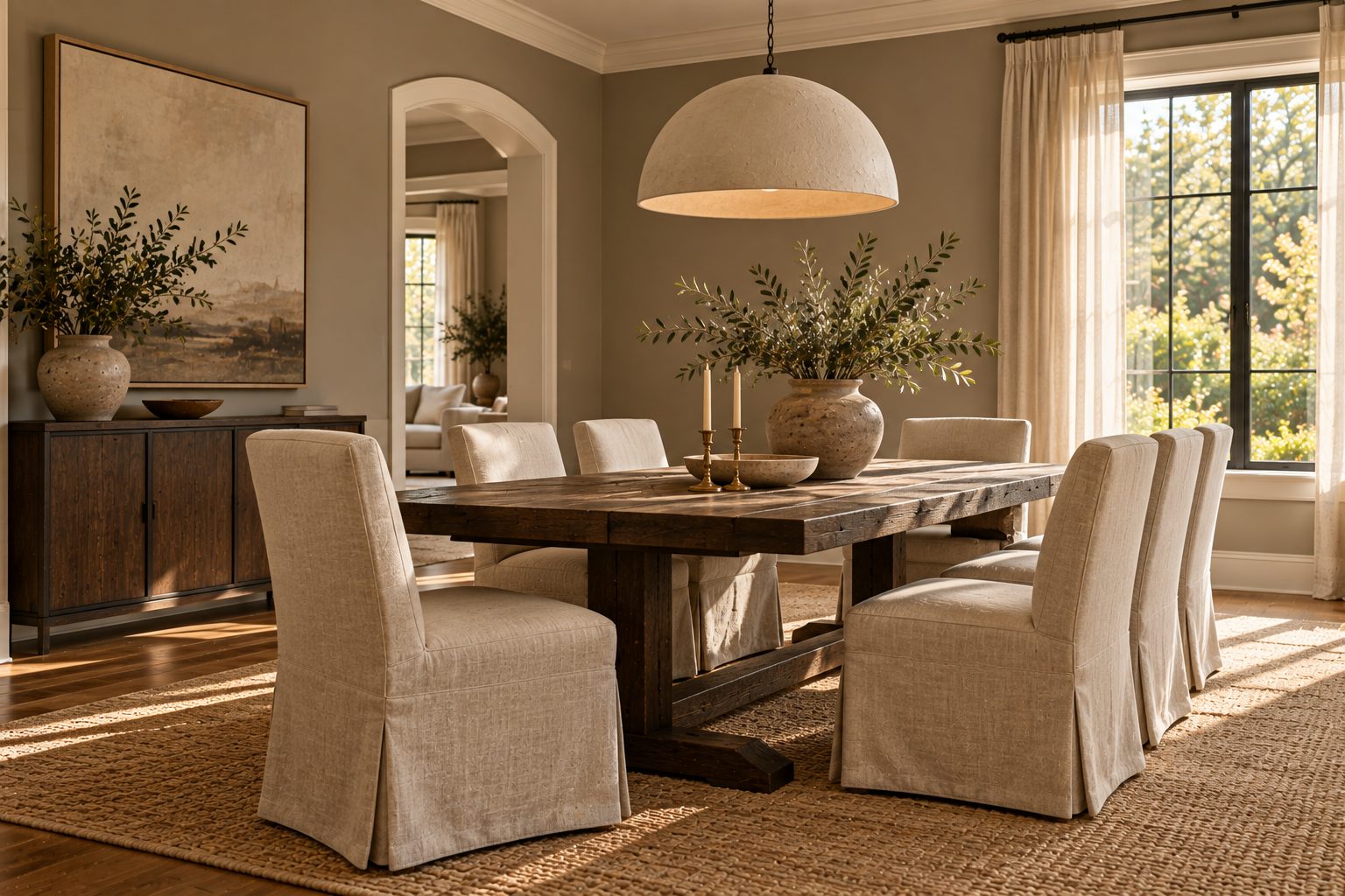
Key takeaways
- Taupe is a gray-brown, usually with a faint violet or pink cast; greige is lighter and cleaner, a gray with beige mixed in
- For walls, choose taupe at LRV 35–60 and greige at LRV 55–70; below LRV 30 a taupe reads as brown
- Undertone decides success: test samples on two walls under 2700–3000K bulbs before you buy gallons
- Pair taupe walls with warm white trim at LRV 82–88, not stark blue-white, and with oak, linen and bronze
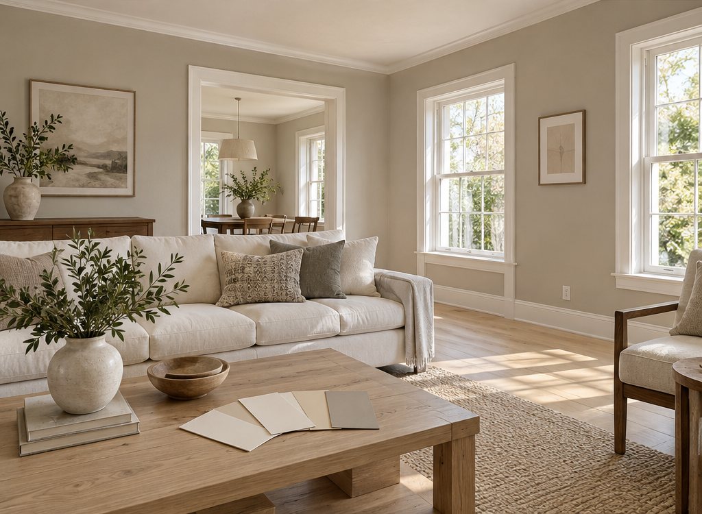
Taupe paint colors are gray-browns: brown mixed with gray, often carrying a faint violet or pink undertone, sitting between beige and gray on the color wheel. Greige is its lighter, cleaner cousin. For walls, the most livable taupes land at LRV 35–60, and greige at LRV 55–70 if you want a room that still feels light.
- Definition: taupe is a warm or neutral gray-brown; the name comes from the French word for mole.
- Undertones: violet, pink, green or yellow, and the undertone matters more than the depth.
- Best wall range: LRV 35–60 for taupe, 55–70 for greige paint colors.
- Lighting: warm bulbs at 2700–3000K keep taupe soft; cool 4000K+ light turns it ashy.
- Trim: warm white at LRV 82–88, never a blue-tinged bright white.
Taupe and greige are two of the hardest-working shades in our neutral paint colors guide, and in 2027 they are taking over from the cool grays of the last decade. This page explains what the taupe color actually is, how it differs from greige and gray beige paint, and how to pick one that does not turn muddy on your walls.
What color is taupe?
Taupe is a dark gray-brown, a neutral made by mixing brown with gray, and on walls it reads as a soft, earthy shade between mushroom and stone. People ask "what colour is taupe color" because the word covers a wide band: paint makers sell everything from pale putty to deep cocoa-gray under the same name.
In practice, think of three families. Light taupe paint colors look like weathered linen or wet sand with a gray veil. Mid taupes resemble mushroom, driftwood or clay. Dark taupe color sits close to umber, and in low light it can pass for a soft brown. What links them is a gray component that stops them from looking yellow or orange, which is what separates taupe from beige.
Is taupe brown or gray?
Taupe is both: it is a brown that has been grayed down, so in daylight it usually reads brown first and gray second. The higher the gray content, the cooler and more mineral it looks; the more brown, the closer it drifts to a taupe brown color like milk chocolate dusted with ash. If a sample looks purely gray next to a white card, it is probably a warm gray, not a true taupe.
Is taupe a warm or cool color?
Taupe is usually a warm neutral, but it can lean cool when its undertone is violet or blue, so you have to judge each shade rather than the name. A warm taupe has a yellow, red or pink base and glows under lamplight. A cool taupe carries violet or green-gray and looks crisper and more stony.
The quickest test is to hold the sample against a sheet of plain printer paper and a primary color card. A pink or mauve flush means a warm, slightly rosy taupe that suits traditional and quiet luxury rooms. A greenish cast means it will pair well with sage, olive and natural wood. A violet cast looks sophisticated in north light but can turn lilac-gray in a room with blue-toned LED bulbs. Warm taupe paint is the safer default for most homes because it flatters skin, oak floors and cream textiles.
Taupe vs greige vs gray beige paint: what is the difference?
Taupe is a deeper gray-brown, greige is a lighter gray-beige blend, and "gray beige paint" is simply the descriptive name for greige; the difference is depth and how much brown you see. The table compares them with beige and warm gray so you can place a sample.
| Color | Typical LRV | What you see | Common undertone | Best use |
|---|---|---|---|---|
| Warm gray | 45–70 | Gray first, a hint of warmth | Beige, green | Modern rooms, offices |
| Greige | 55–70 | Even mix of gray and beige | Green, yellow | Whole-house walls, open plans |
| Light taupe | 45–60 | Pale gray-brown, linen-like | Pink, violet | Bedrooms, living rooms |
| Mid taupe | 30–45 | Mushroom, driftwood | Violet, red | Dining rooms, accent walls |
| Dark taupe | 12–30 | Umber, cocoa-gray | Red, brown | Libraries, cabinetry, color drenching |
| Beige | 55–75 | Sandy, little or no gray | Yellow, pink | Traditional and coastal rooms |
LRV, light reflectance value, runs from 0 (black) to 100 (pure white). Values are typical ranges for each family, not readings from a specific product. If you want sandier, sunnier neutrals, see our beige paint colors guide; if you want the color to lean cleaner and cooler, our gray paint colors guide covers the next step over.
What are the best taupe paint colors by depth?
The best taupe paint colors for most homes are light and soft taupes at LRV 45–60 for main walls, with one mid or dark taupe reserved for a single room, cabinetry or doors. Depth should follow the light you have, not the mood board.
#D8CFC3#BCAF9F#A08C7A#8A7F76#5E5248The hex values are approximate screen references, not product matches; always judge a physical sample on the wall.
- Light taupe paint color (LRV 50–60): the whole-house option. It reads as a warm off-neutral in bright rooms and a calm gray-brown at dusk.
- Soft taupe (LRV 42–52): enough depth to make white trim stand out, light enough for a hallway with one window.
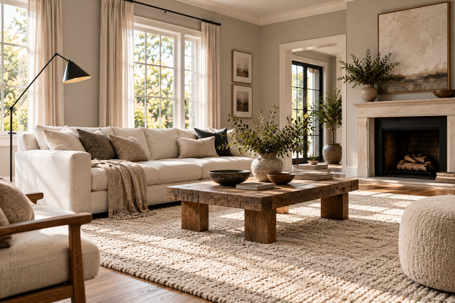
- Warm taupe (LRV 35–45): the best choice for living and dining rooms with south or west light; it turns honeyed in the evening.
- Cool violet taupe (LRV 35–45): elegant with marble, chrome and charcoal, but test it carefully in north light.
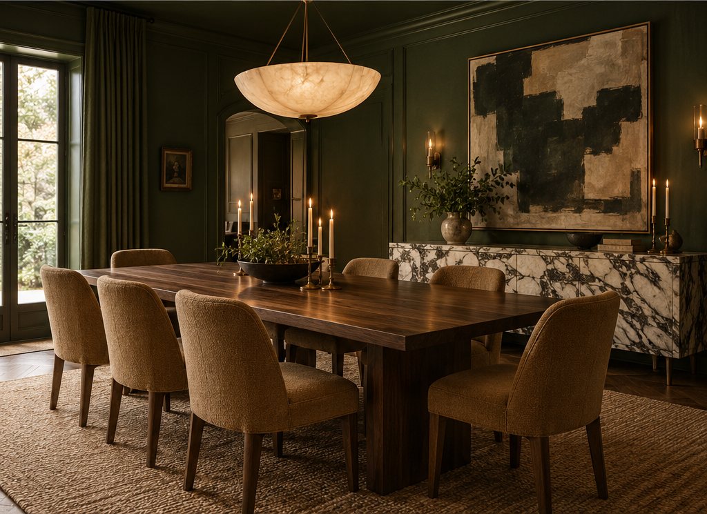
- Dark taupe color (LRV 12–25): for snugs, powder rooms, kitchen islands and painted doors; pair with brass.
Which are the best greige paint colors?
The best greige paint colors sit at LRV 58–68 with a quiet green or yellow undertone, because that range stays light on overcast days and never turns pink or purple. Greige paint is the safest choice for open-plan homes where one color has to run through rooms facing different directions.
Warm greige paint colors are the 2027 direction. They lean slightly toward beige, so they sit happily with warm white oak, walnut, cream linen upholstery and the earthy palettes forecast for 2027. Cooler greiges, with more gray and a hint of green, still suit modern kitchens with white quartz and stainless steel, and they bridge the gap if you are moving away from a gray house one room at a time.
Three rules for choosing a greige color. First, compare at least three samples side by side; greige undertones only show in comparison. Second, check it next to your floor, since a yellow-oak floor can push a green-leaning greige toward khaki. Third, if your rooms are dim, go one step lighter than you think, because greige at LRV 55 in a north-facing room can look like wet cement.
Where do taupe walls work best?
Taupe walls work best in rooms with warm or plentiful daylight and in spaces used mostly in the evening, such as living rooms, dining rooms and bedrooms. They are less reliable in small, dim, north-facing rooms, where a taupe can flatten into gray-brown mud.
- South- and west-facing rooms: the warm light suits almost any taupe; you can go darker here, down to LRV 35.
- North-facing rooms: choose a warm taupe or greige with a pink or yellow base and keep LRV above 50.
- East-facing rooms: bright in the morning, flat in the afternoon; a soft taupe at LRV 45–55 handles both.
- Bedrooms: light taupe with a rosy undertone is restful and flattering in mirrors.
- Kitchens: a dark taupe on lower cabinets with a greige wall reads warm without the heaviness of navy or black.
Lighting changes everything. Use 2700K bulbs in living spaces and 3000K in kitchens, with CRI 90 or higher, so the brown component renders accurately. Cool 4000–5000K bulbs strip out the warmth and leave taupe looking dull.
What colors go with taupe?
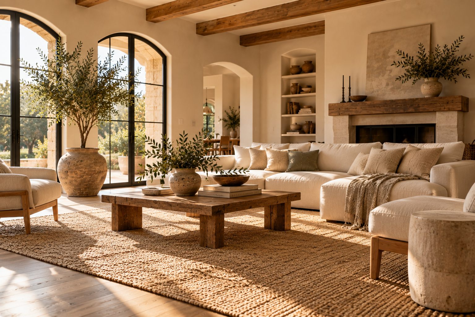
Taupe goes best with warm whites, cream, sage and olive greens, terracotta, soft black and natural materials such as oak, linen, travertine and aged bronze. Because it already contains gray and brown, it acts as a bridge between warm and cool accents.
For trim and ceilings, choose a warm white at LRV 82–88; a brilliant white at LRV 90+ looks blue against taupe and makes the walls look dirty. Our warm white paint colors guide lists the undertones that sit comfortably beside a gray-brown. For contrast, dusty sage cushions, rust or clay ceramics and a charcoal or soft-black door bring a taupe room to life. Avoid pairing taupe with bright primary colors and with icy blue-gray, which both make it look tired.
How to choose and test a taupe paint color
Choose taupe by testing large samples on two walls for at least two days, under both daylight and your own bulbs, before committing. This is the process we use for client rooms:
- Shortlist three to five samples across one depth band, for example LRV 40–55, rather than wildly different shades.
- Paint sample boards at least 12 x 18 in (30 x 45 cm), two coats, with a white border so the wall color does not distort them.
- Place them on two walls, one facing the window and one beside it, and near the floor and the trim.
- Check at 9 am, 2 pm and after dark with lamps on; write down which one still looks right at night.
- Compare against fixed finishes: floor, kitchen counters, sofa fabric and any stone.
- Pick the sheen: matte or flat for ceilings and low-traffic walls, eggshell for living areas, satin for hallways and kids' rooms; our paint sheen guide explains the trade-offs.
- Calculate quantities with our paint calculator; most taupe paint covers 350–400 sq ft (32–37 m²) per gallon per coat.
Budget typically runs $35–90 per gallon in the US for good-quality interior acrylic, and darker taupes may need a tinted gray primer and a third coat on new drywall.
Mistakes we see with taupe and greige
The mistake we see most often is choosing taupe from a small chip in a showroom, then finding it turns purple, pink or green on four walls at home. Undertones multiply when color surrounds you, which is why a 1 in chip is useless for a final decision.
- Going too dark in a dim room: a taupe below LRV 35 in a north-facing room makes it feel smaller and colder, not cozier.
- Bright white trim: it makes taupe walls look grubby; pick a creamier white.
- Mixing two greiges with different undertones in connected rooms; one will make the other look wrong.
- Ignoring the floor: orange-toned oak plus violet taupe is a clash that no styling fixes.
- Cool LED bulbs: at 4000K and above, the warmth disappears.
Our verdict: for most homes in 2027, a warm light taupe or warm greige at LRV 50–62 on main walls, warm white trim and one darker taupe for doors, an island or a snug gives you the quiet, layered neutral look without the risk. Taupe paint rewards patience during testing more than any other neutral. If you would rather skip the guesswork, our palette pack includes tested taupe, greige and warm white combinations with trim, ceiling and accent pairings ready to sample.
Free toolCurtain Size CalculatorRod length, panel size, ready-made match and yardage.Shop & source the look
Buy it today — or have it made
Retail links are affiliate links: we may earn a commission at no extra cost to you (disclosure). “Get it made” sends the item to our sourcing desk for factory quotes in custom sizes and finishes.
Frequently asked questions
What does the color taupe look like?
Taupe looks like a soft gray-brown, similar to mushroom, driftwood or wet stone. Lighter versions read as a grayed linen; darker versions resemble umber or cocoa dusted with gray. Most taupes carry a slight pink, violet or green undertone, which becomes more obvious when the color covers a whole room rather than a small chip.
Is taupe a warm or cool color?
Taupe is usually a warm neutral, because its base is brown, but shades with a violet or blue-gray undertone read cooler. Hold a sample against white paper: pink or yellow suggests warm, violet or green-gray suggests cool. Warm taupes are easier to live with and look best under 2700–3000K lighting.
Is taupe brown or gray?
Taupe is a brown that has been mixed with gray, so it sits between the two. In daylight most taupes read brown first, while in cool or dim light they look grayer. If a sample looks completely gray beside white paper, it is closer to a warm gray than a true taupe.
What is the difference between taupe and greige?
Taupe is deeper and browner, typically LRV 25–55, while greige is a lighter blend of gray and beige at LRV 55–70. Greige suits whole-house walls and open plans; taupe adds more warmth and depth and suits living rooms, dining rooms, bedrooms, cabinetry and accent walls.
What color trim goes with taupe walls?
A warm white trim at LRV 82–88 goes best with taupe walls. Creamy whites echo the brown in taupe and look clean without glare, while stark blue-whites make taupe look dull or dirty. For a bolder look, paint trim the same taupe in a satin finish, or use a soft black on doors.
Some links may be affiliate links. Regulations and specifications change — always confirm with suppliers and qualified professionals.